The Macro Indicators We Watch
The signals we return to week after week, refreshed nightly from public US economic data so the numbers are never stale.
The full indicator dashboard is a Premium feature.
Eight macro indicators, refreshed nightly, with the data and the read on what each one is telling you.
$240/year (just $20/month) · 14-day money-back guarantee
Already a subscriber?
Incorrect password. Please try again.
Leading Indicators
Leading Indicator: Chicago Fed Activity Index
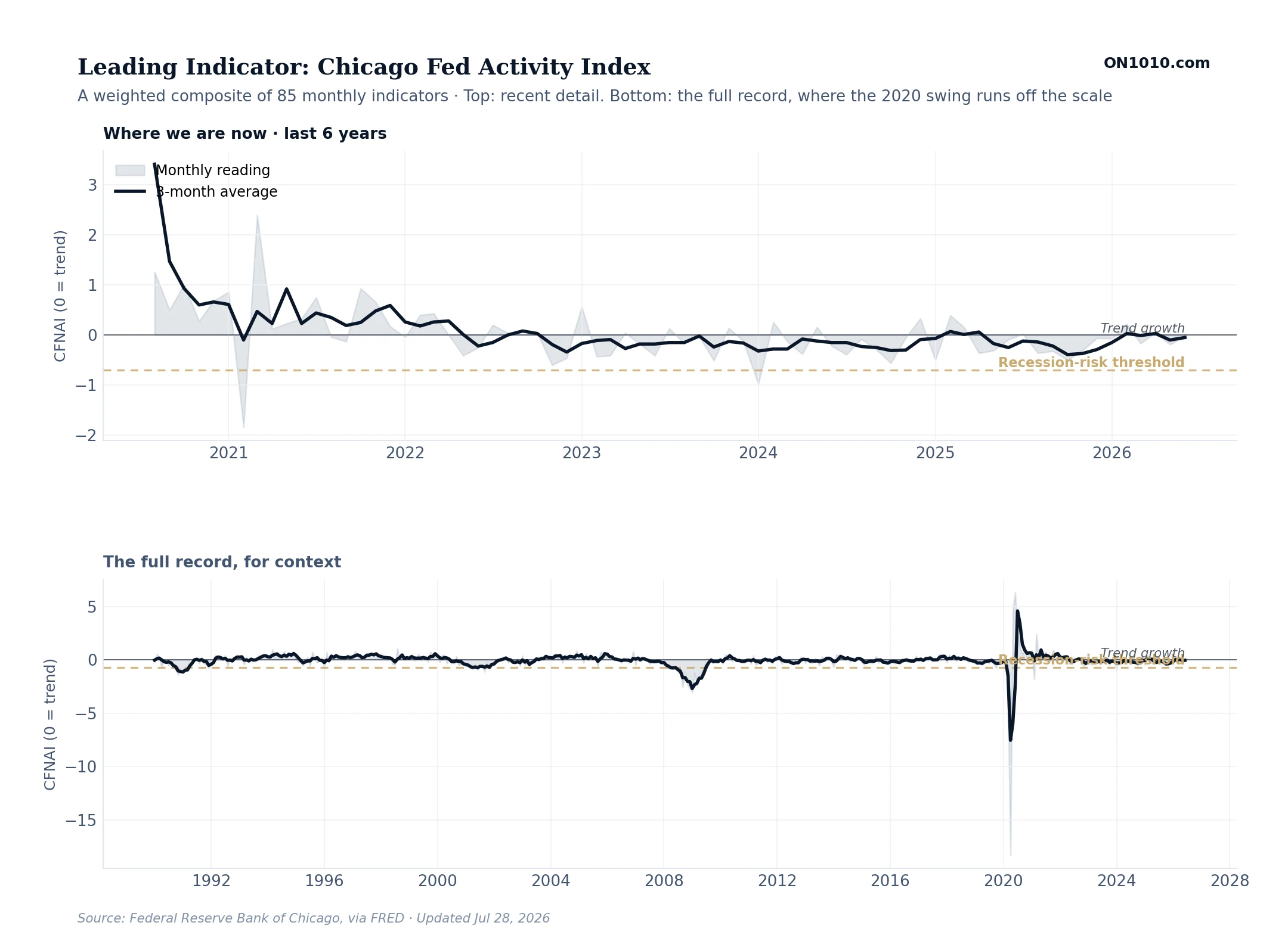
What this measures
A single number that summarizes the whole US economy. CFNAI stands for the Chicago Fed National Activity Index. It is a weighted average of 85 separate monthly indicators covering production, jobs, sales, and consumer spending. A reading of zero means the economy is growing at its long-run trend. Positive means above trend, negative means below. The light gray band shows each month’s reading, which jumps around. The dark line is the 3-month average, which smooths out the noise and is the version most economists watch.
How to read it
Watch the 3-month average line against the two reference lines. Zero is trend growth. The gold dashed line at negative 0.7 is the recession-risk threshold. When the 3-month average drops below negative 0.7 and stays there, the economy is contracting fast enough that a recession is likely. When it sits between zero and negative 0.7, growth is slowing but not yet alarming. When it climbs above zero, the economy is running above its trend speed. This is the closest thing we have to a single dial for the whole economy.
Yield Curve: 10-Year minus 2-Year Treasury
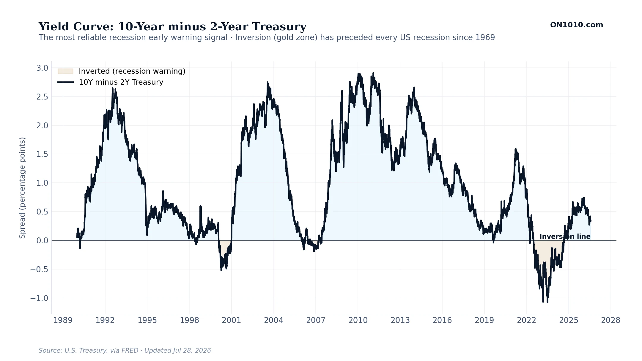
What this measures
The difference between the interest rate on a 10-year US Treasury bond and a 2-year US Treasury note. Normally the 10-year yields more than the 2-year because investors want more compensation for tying up money longer. When the 2-year yields more (the line drops below zero, shown in gold), the yield curve is inverted. Inversion has preceded every US recession since 1969, usually by 12 to 24 months.
How to read it
When the spread is positive (light blue zone), banks make money by borrowing short and lending long, which keeps credit flowing through the economy. When the spread inverts and goes negative (gold zone), that profit disappears and banks tighten lending. Inversion is the warning. The economy usually slips into recession not while the curve is inverted but after it un-inverts back above zero. The sequence to watch is: inversion, then steepening back up, then the actual downturn.
Inflation & Prices
PCE Inflation: Headline vs Core
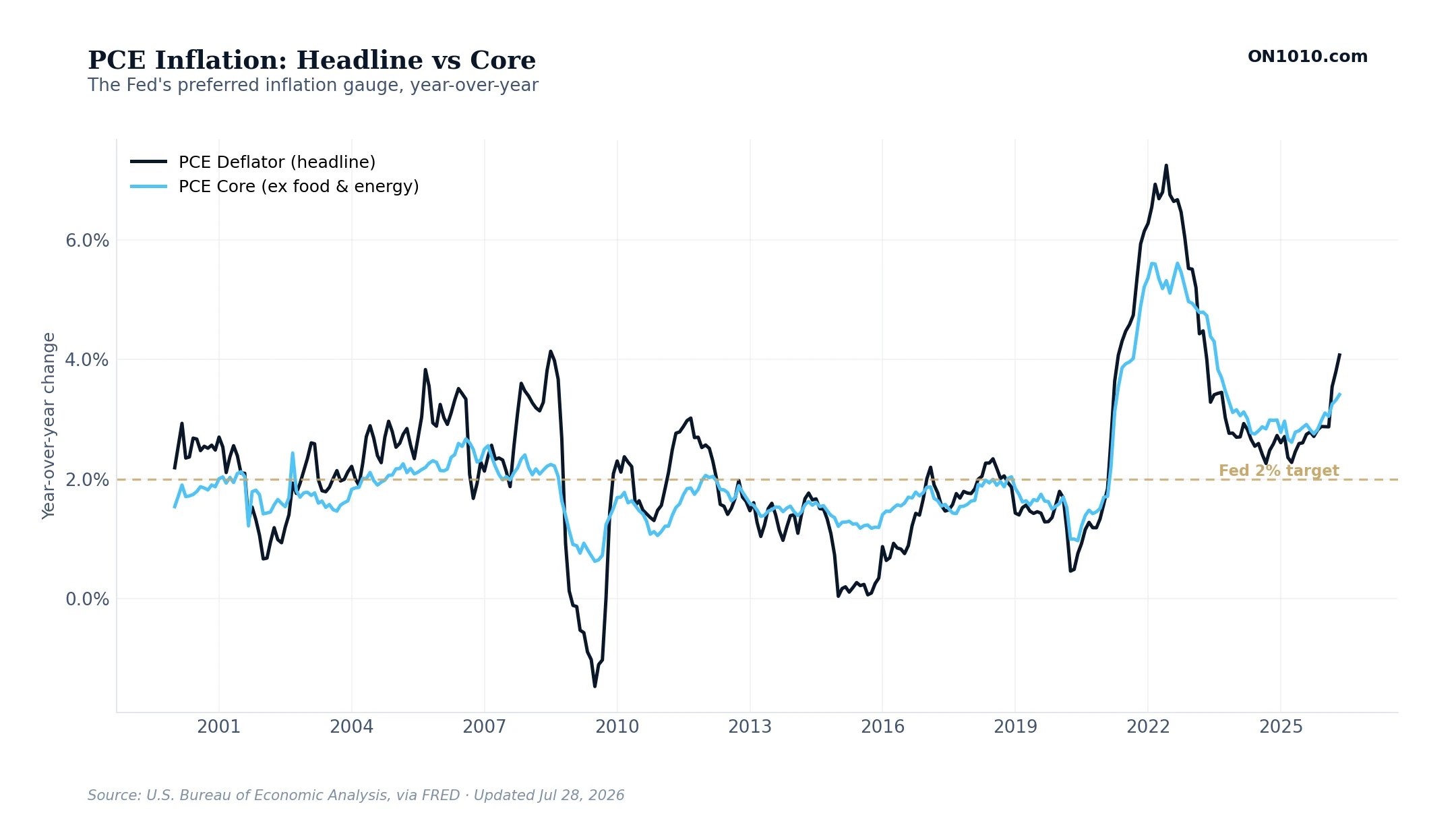
What this measures
The two inflation numbers the Federal Reserve watches most closely. PCE stands for Personal Consumption Expenditures. It tracks the prices Americans actually paid for goods and services. The dark line, Headline PCE, includes everything. The light blue line, Core PCE, leaves out food and energy because those prices jump around for reasons the Fed cannot control. Both are shown as the percentage change from the same month a year ago. The gold dashed line is the Fed’s 2 percent target.
How to read it
The Fed pays more attention to Core PCE because food and energy prices move on weather, wars, and supply shocks. None of those have anything to do with interest rates. Watch the gap between the two lines. When the gap is wide, something temporary is pushing the headline number around. When the gap is narrow, inflation is spread across the whole economy. As long as the Core line stays above 2 percent for a long stretch, the Fed will keep interest rates high.
PCE Inflation: Month by Month
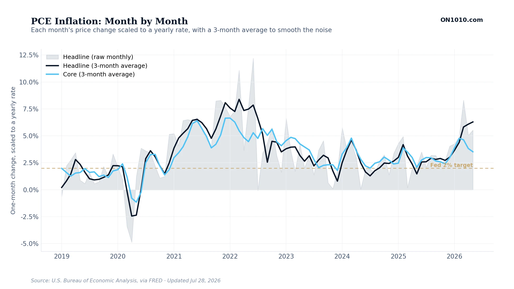
What this measures
The freshest read on inflation. Instead of comparing prices to last year, this chart asks how much prices changed in the last month, and what that would work out to if the same pace kept up for a full year. The light gray band shows each individual month, which jumps around a lot. The dark line (Headline PCE, the prices Americans actually paid) and the light blue line (Core PCE, the same number without food and energy) are 3-month averages of the monthly data, which smooths out the noise. The gold dashed line is the Fed’s 2 percent target.
How to read it
The year-over-year inflation number you usually hear in the news is an average of the last twelve months, so it always reflects what was happening a while back. The monthly numbers in this chart show what is happening right now. If the 3-month average stays below 2 percent for several months in a row, the year-over-year number will eventually drop too, as the older high months drop out of the count. This chart is the early-warning version of the inflation story.
PCE Inflation vs Fed Policy
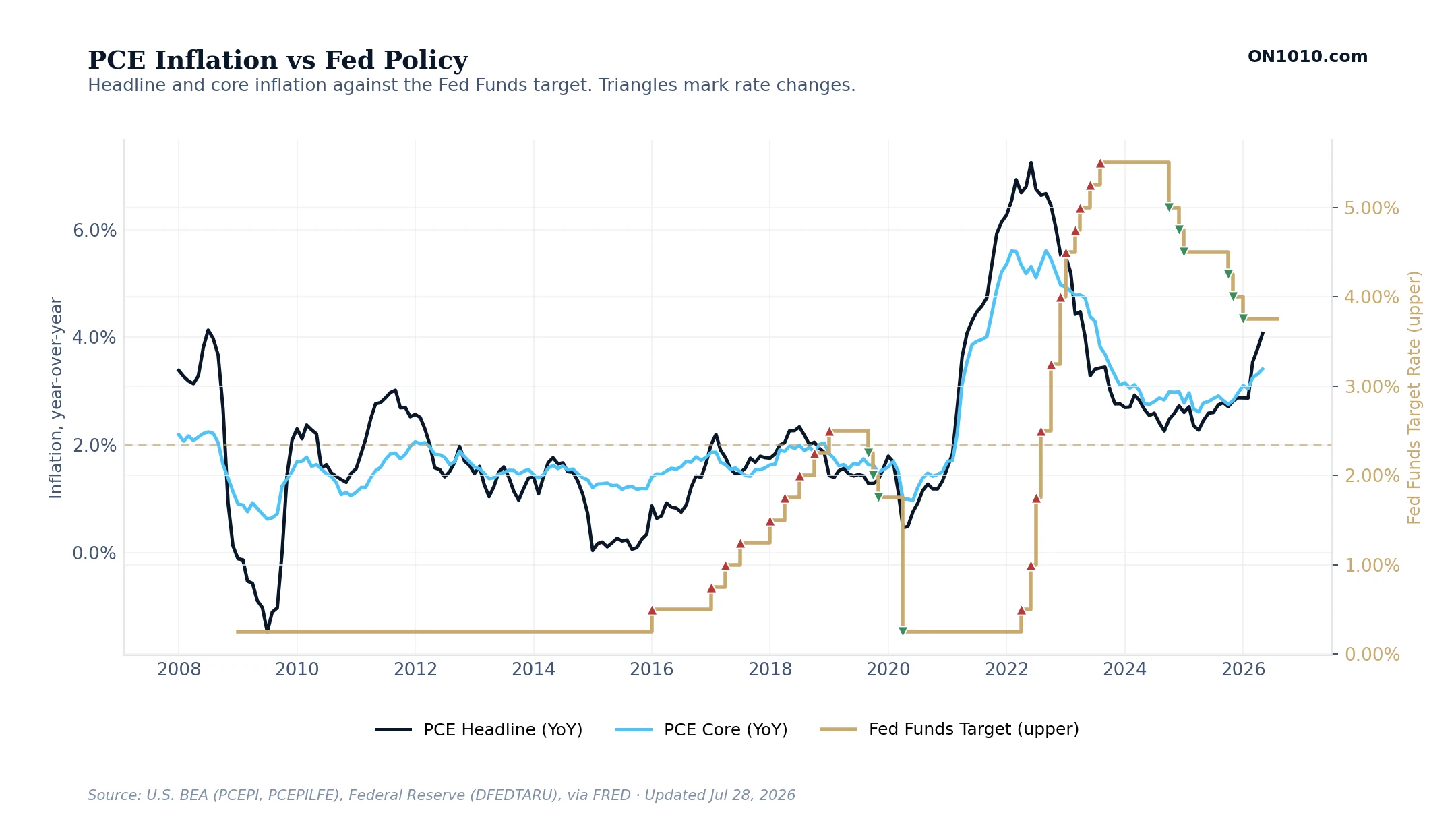
What this measures
Inflation and Federal Reserve policy on the same chart. The dark line is Headline PCE inflation (Personal Consumption Expenditures, the prices Americans actually paid). The light blue line is Core PCE, the same measure without food and energy. The thin step-line is the Fed Funds rate, the short-term interest rate the Federal Reserve sets. Red triangles mark the months the Fed raised rates. Green triangles mark the months the Fed cut rates. The gold dashed line is the Fed’s 2 percent inflation target.
How to read it
This chart answers one question: how did the Fed respond to past inflation cycles? Compare the timing of the triangles to where the inflation lines crossed the 2 percent target. Did the Fed start hiking before inflation hit 2 percent, right at it, or after? When Core inflation is well above target but the rate line is flat, the Fed is being patient. When Core has come back to target but the Fed keeps moving rates, the Fed is reacting to something else, usually problems in the financial system, the job market, or political pressure.
Where the Fed Has Cover
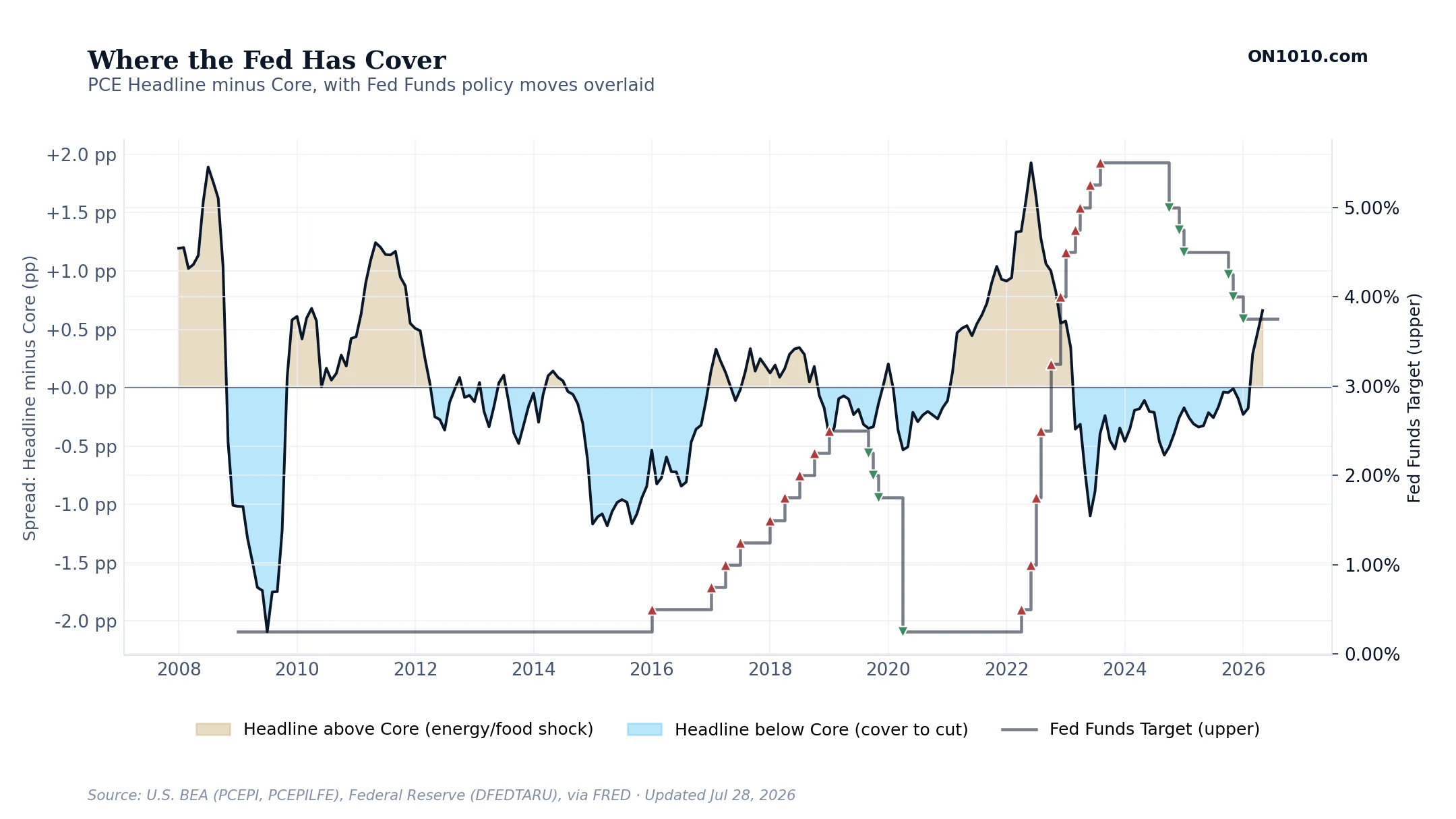
What this measures
The difference between Headline PCE inflation, which includes food and energy, and Core PCE inflation, which does not. The chart shows that gap in percentage points. When the gap is positive (gold zones), Headline is running hotter than Core, usually because of high gas or food prices. When the gap is negative (light blue zones), Headline is below Core, usually because energy is falling while wages and rents stay high. The thin step-line is the Fed Funds rate. Red triangles mark rate hikes, green triangles mark rate cuts.
How to read it
This chart shows the political tension the Fed is under. When the gap is wide and positive (gold), people feel inflation at the gas pump and the grocery store. They demand the Fed do something, even though the Fed’s official target uses the Core number. When the gap flips negative (blue), the Fed gets political cover to cut rates because the Headline number is cooling, even if Core is still uncomfortable. Looking back at past rate cuts, many of them came right after the gap flipped to blue.
Core CPI by Component
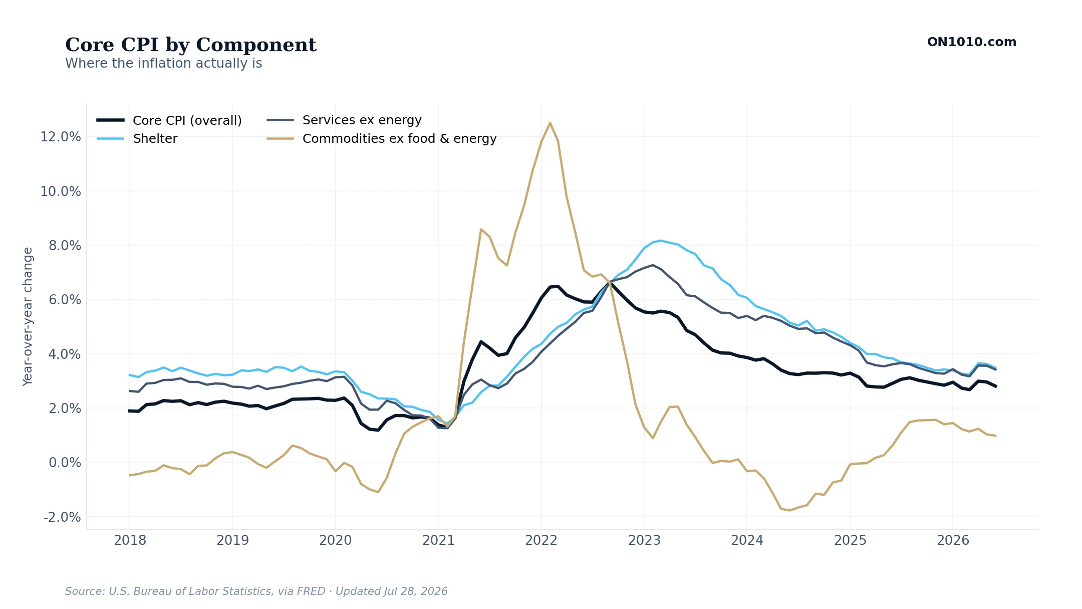
What this measures
Why inflation is happening, broken into three pieces. CPI stands for Consumer Price Index, an older measure of inflation that the government still reports every month. Core CPI leaves out food and energy. This chart splits Core CPI into three parts: housing costs (rent plus the cost of owning a home), services other than energy (haircuts, healthcare, restaurant meals), and goods other than food and energy (clothes, cars, appliances). The top line is the total Core CPI. Every number is the percentage change from the same month a year ago.
How to read it
Inflation in any given year is really a story about which piece is doing what. Housing moves slowly and lags real-world rents by 12 to 18 months. Services prices are driven mostly by wages, which makes the job market the real story there. Goods prices are about supply chains, the cost of imports, and the strength of the US dollar. When the total Core line looks high, the question is not whether inflation is a problem. It is which of these three pieces is the problem this time.
Labor & Employment
Labor Health vs Consumer Confidence
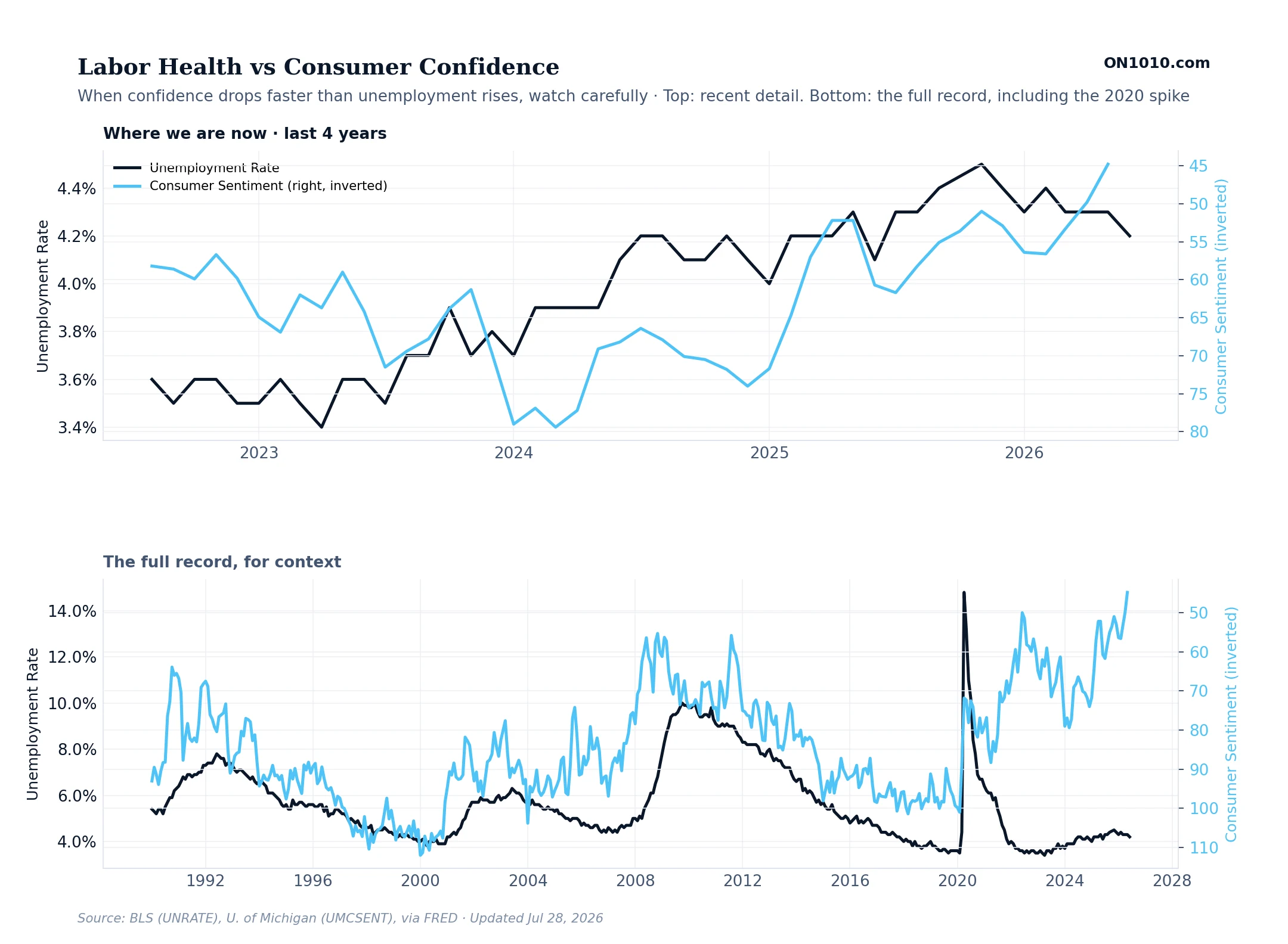
What this measures
How working Americans are doing, on two measures. The dark line is the official US unemployment rate, the share of people who want a job but cannot find one. The light blue line is consumer sentiment, the University of Michigan’s monthly survey of how Americans feel about the economy. The sentiment line is flipped upside down on the chart so that both lines move the same direction when things are getting worse. The two measures use different scales, but you can compare the shapes.
How to read it
When the two lines stay close together, the economy is in balance. What people feel matches what the data says. When sentiment falls faster than unemployment rises, people are feeling pressure that has not shown up in the jobs numbers yet. That is often an early warning. When unemployment rises faster than sentiment falls, the job market has cooled but people have not fully realized it yet. Either way, the bigger the gap between the two lines, the more change is coming.
Temp Hiring vs Continuing Claims
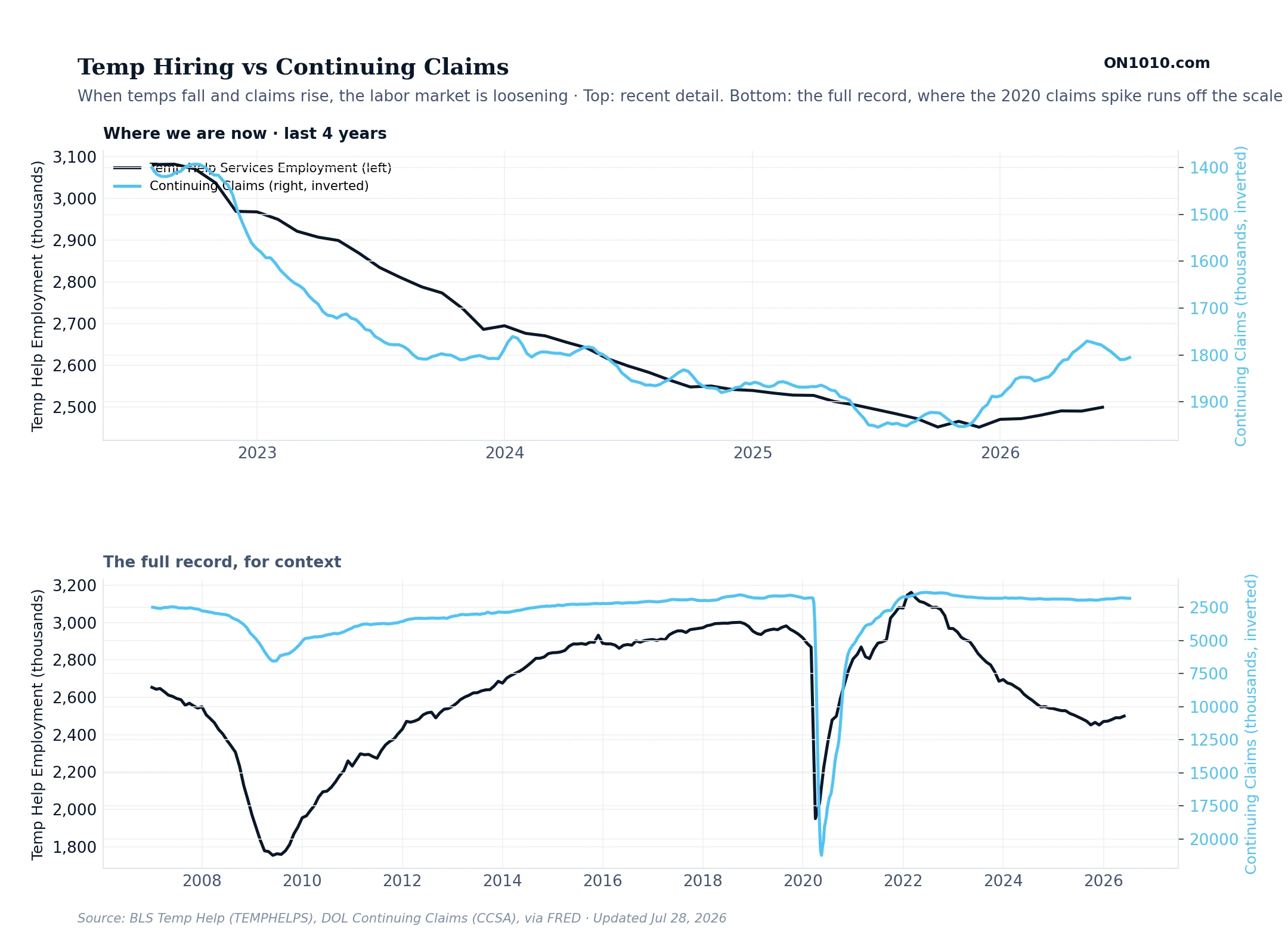
What this measures
Two measures of how the job market is changing in real time. The dark line is the number of temporary workers on US payrolls. Temp workers are usually the first ones companies hire when business picks up, and the first ones they let go when business slows. The light blue line is continuing unemployment claims, the number of people still collecting unemployment benefits week after week. The claims line is flipped upside down so that both lines move the same direction when the job market is weakening.
How to read it
Temp jobs are the early warning of the wider labor market. Companies adjust their temp workforce before they touch their permanent staff. When temp jobs fall and continuing claims rise (which appears as the two lines moving the same direction on this chart), the job market is cooling in real time. When both lines move sideways, the market is in a holding pattern. When temp jobs rise and claims fall, hiring is picking up.
Housing & Credit
Housing Pulse: Mortgage Rate vs New Home Sales
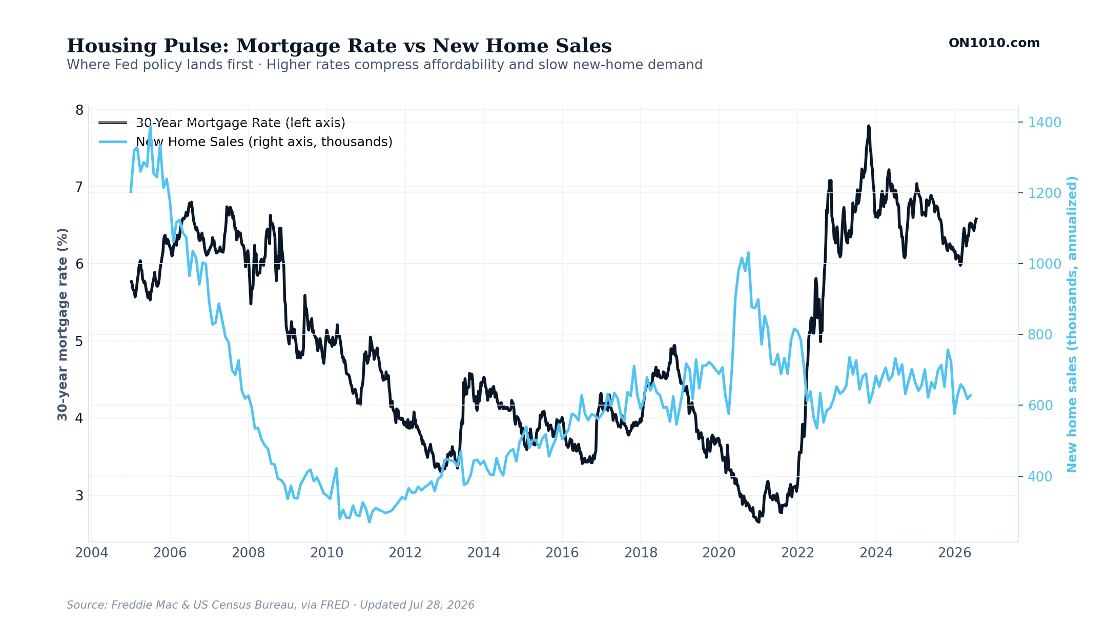
What this measures
The two halves of the housing cycle on one chart. The dark line is the average rate on a new 30-year fixed-rate mortgage, reported weekly by Freddie Mac. The light blue line is new single-family home sales, reported monthly by the US Census Bureau, in thousands of homes at an annualized rate. Higher mortgage rates make monthly payments more expensive, which slows home buying. The two lines tend to move in opposite directions.
How to read it
Housing is where Federal Reserve interest-rate policy lands first. When the Fed raises rates, mortgage rates follow, monthly payments jump, buyers step back, and new home sales drop within months. When the Fed cuts, the sequence runs in reverse but more slowly because buyers wait to see if cuts will hold. Watch for divergence: if rates fall and sales still don’t recover, the problem is no longer affordability, it is confidence in the broader economy.
High-Yield Credit Spread
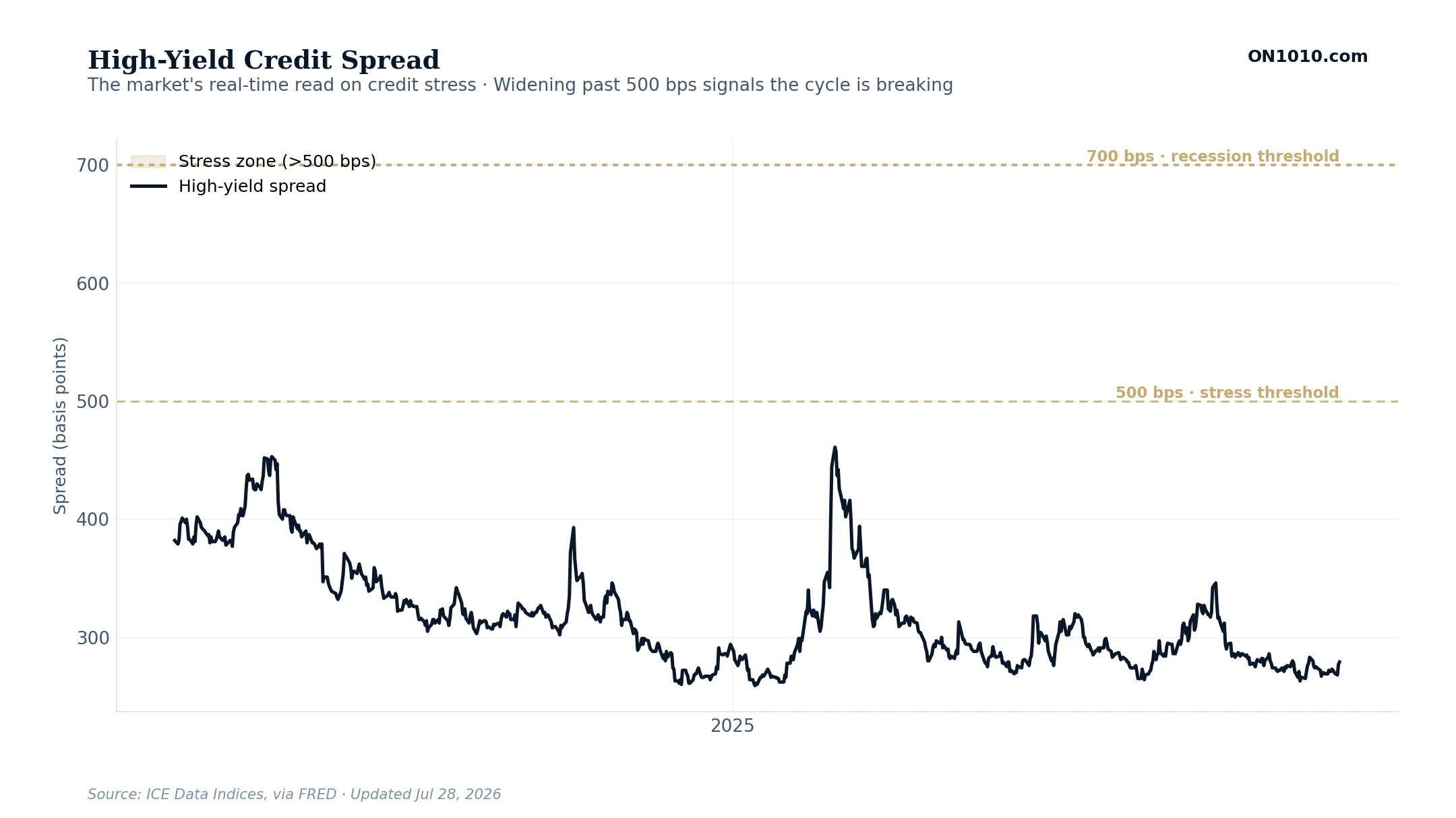
What this measures
The extra interest rate that lower-rated companies pay to borrow, compared to the US government. The data series is the ICE BofA US High Yield Index Option-Adjusted Spread, shown in basis points (one basis point equals one-hundredth of a percent). It tracks the yield on bonds rated below investment grade. When credit markets are calm, the spread is tight (below 500 bps). When markets fear defaults, the spread widens fast. The gold-shaded zone above 500 basis points is the stress threshold.
How to read it
This is the market’s real-time read on credit risk. Watch the two threshold lines. Below 500 basis points, credit conditions are easy and money is flowing. Above 500 basis points, lenders are demanding compensation for rising default risk, which usually signals the cycle is breaking. Above 700 basis points, recession is near certain. The spread tends to widen weeks or months before the official data confirms a downturn, which makes it one of the earliest warning signs in the economy.
Debt & Leverage
Household Debt Service Ratio
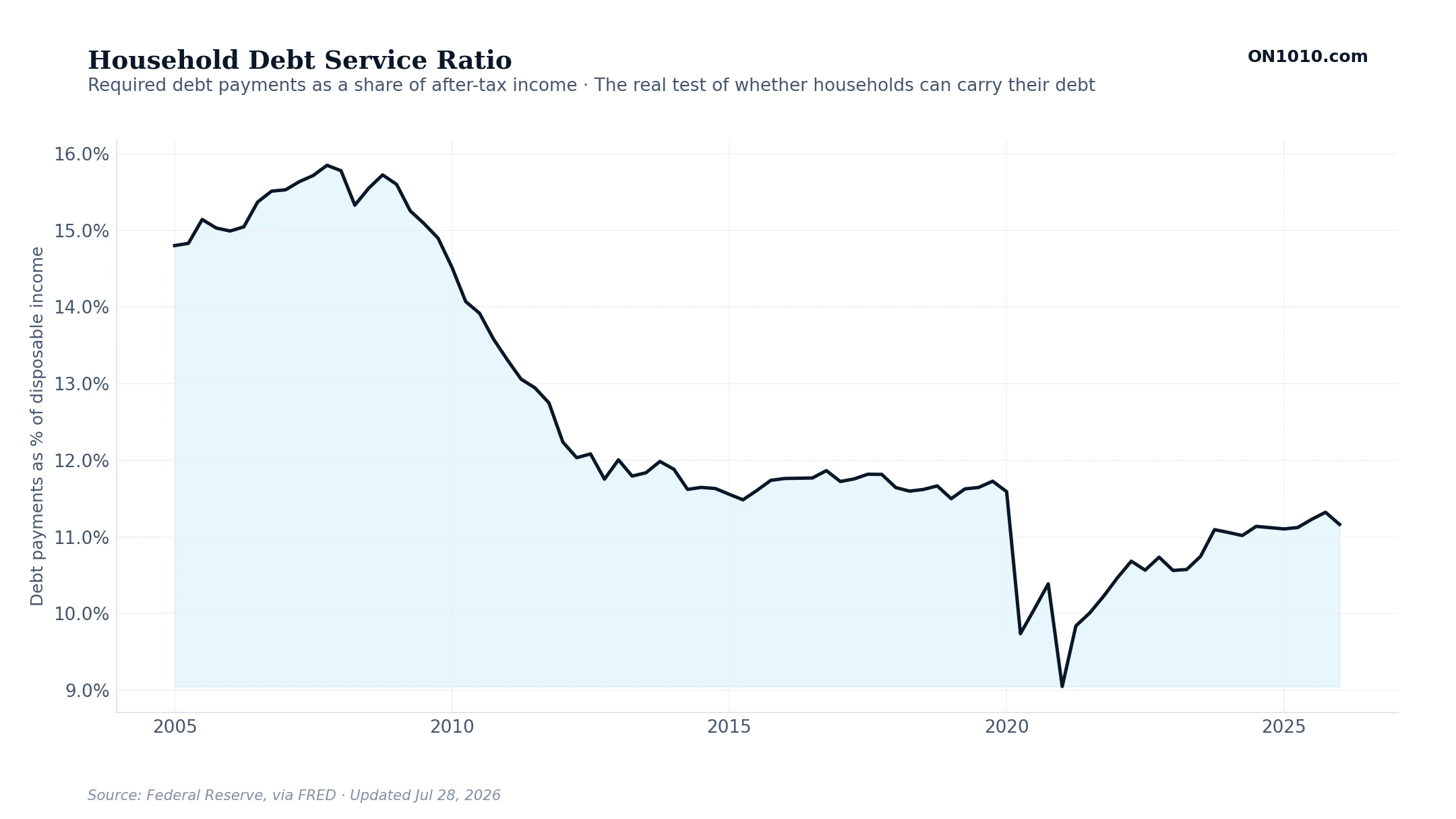
What this measures
How much of a typical household’s after-tax income goes to required debt payments, the mortgage, car loans, credit cards, and the rest. The Federal Reserve calls this the Household Debt Service Ratio. A low number means families have room left in their budget; a rising number means more of every paycheck is spoken for before they buy anything else.
How to read it
This is the real test of whether high debt is a problem. The dollar total of debt can climb for years without trouble, as long as incomes rise too and this ratio stays manageable. Watch the direction. When it rises, households have less left to spend and growth slows. When it holds low, the debt is being carried comfortably. It spiked just before the 2008 housing bust, a picture of what an overstretched consumer looks like.
Consumer Credit Growth
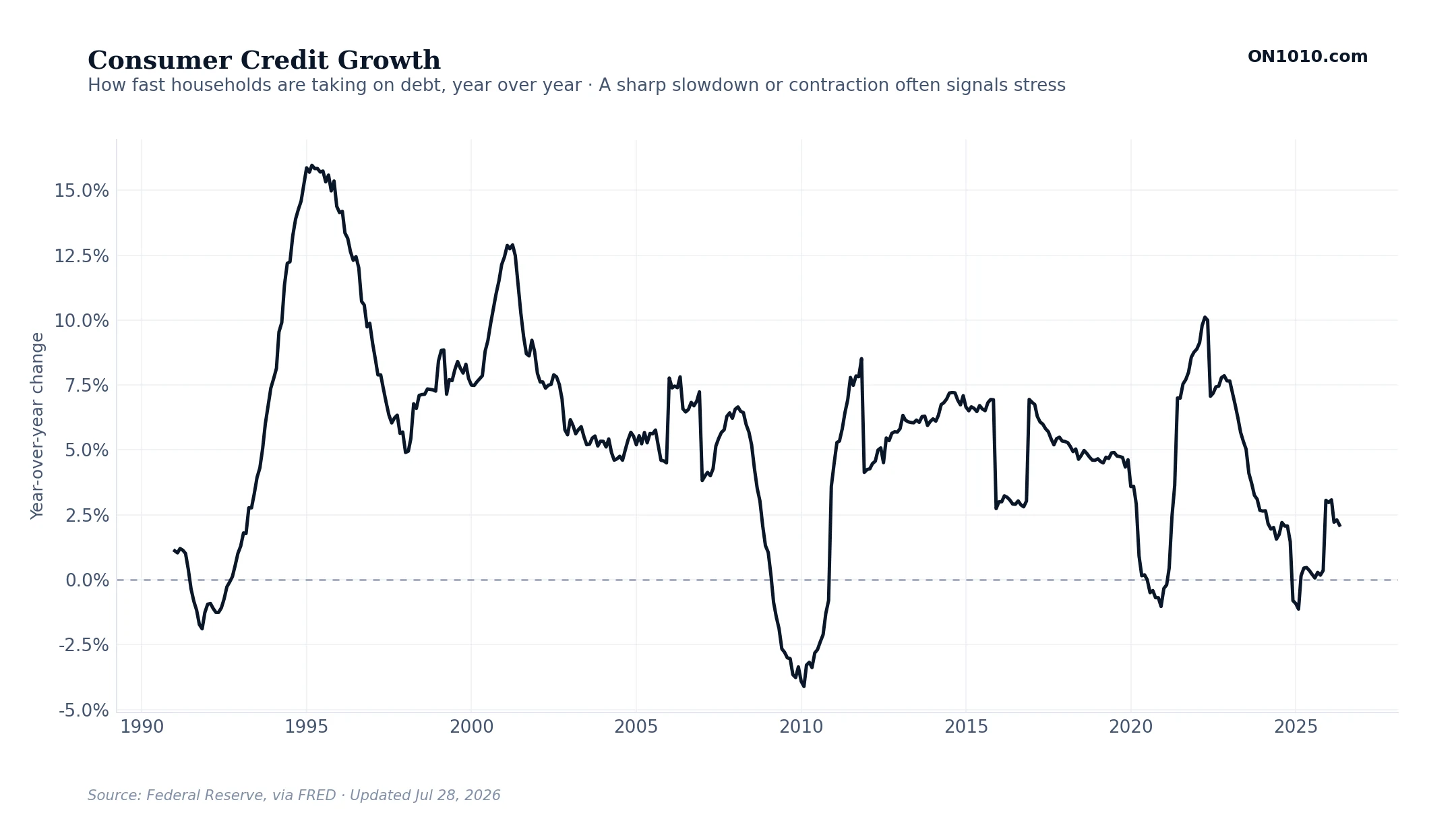
What this measures
How fast Americans are adding to their non-mortgage debt, things like credit cards, auto loans, and student loans, compared with a year earlier. It is the year-over-year change in total consumer credit. Positive means households are borrowing more; near zero or negative means they are pulling back.
How to read it
Borrowing growth signals confidence and stress at the same time. Steady growth usually means people feel good about their jobs and income. A sudden acceleration late in a cycle can mean households are leaning on credit to keep up with prices. A sharp slowdown or an outright decline tends to show up around recessions, when lenders tighten and families retrench. Watch the turns, not the exact level.
Loan Delinquencies
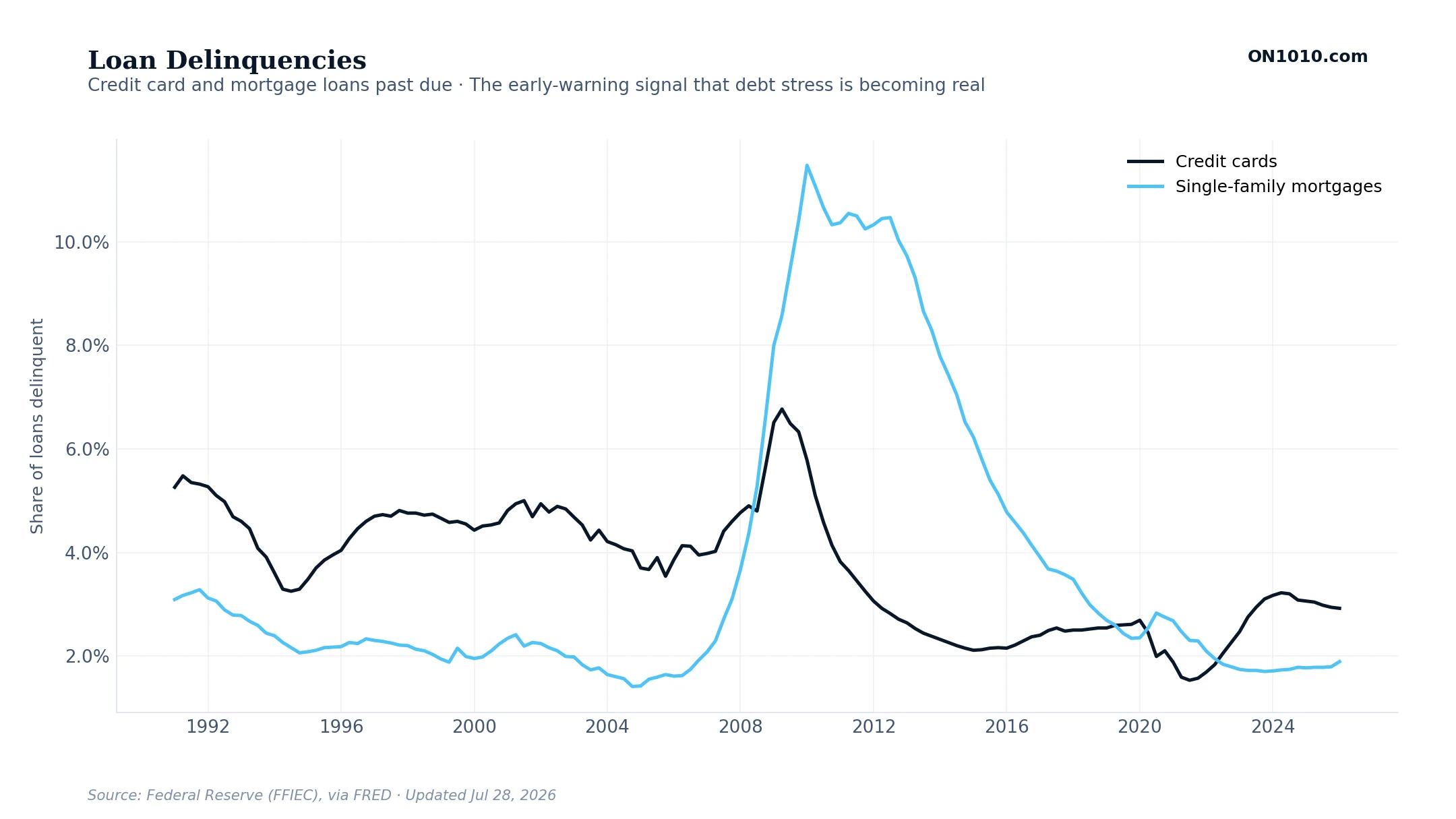
What this measures
The share of credit card loans and home mortgages where borrowers have fallen behind on payments, reported by bank regulators through the Federal Reserve. It is the difference between owing money and actually being able to pay it.
How to read it
This is the early-warning layer. Balances can rise for a long time without trouble, but when more of those loans stop getting paid, the stress is real and spreading. Credit card delinquencies usually turn up first, because cards are where stretched households feel it soonest. Mortgage delinquencies move slower but matter more for the financial system. When both lines drift up together, the debt load is starting to bite.
Federal Debt as a Share of GDP
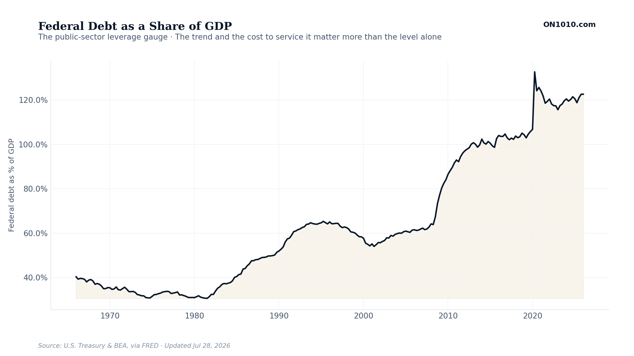
What this measures
The size of the federal government’s total debt measured against the size of the whole economy (GDP). Putting debt next to the economy that has to support it is far more meaningful than the raw dollar figure, which always looks enormous on its own.
How to read it
The level alone rarely triggers a crisis; plenty of countries carry high debt for years. What matters is the trend and the cost to service it. As older, cheaper debt rolls over at today’s higher interest rates, a bigger slice of the federal budget goes just to paying interest, which crowds out everything else over time. Watch the slope of the line, and pair it with where interest rates are heading.
Capital Investment & Corporate Profits
Profits Today, Capex Tomorrow
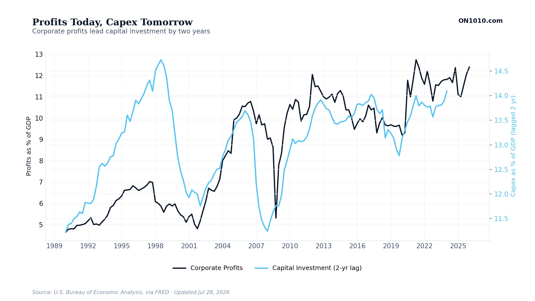
What this measures
How much money US companies are making compared to how much they are spending on new buildings, equipment, and software. Both are shown as a share of Gross Domestic Product, or GDP, the total value of everything the country produces in a year. The investment line is shifted back two years on the chart, so today’s spending lines up with the profits from two years ago. That two-year shift is on purpose. It takes about that long for a company to go from deciding to expand to actually breaking ground.
How to read it
Look at the right edge of the chart. The dark profits line keeps going after the light blue investment line stops. That gap is the forecast. Today’s profit level tells you roughly how much investment is coming over the next two years. When the gap widens, an investment boom is being set up. When the two lines come back together, the cycle is maturing and investment has caught up to profits.
Growth & Output
Real GDP vs Potential Trend
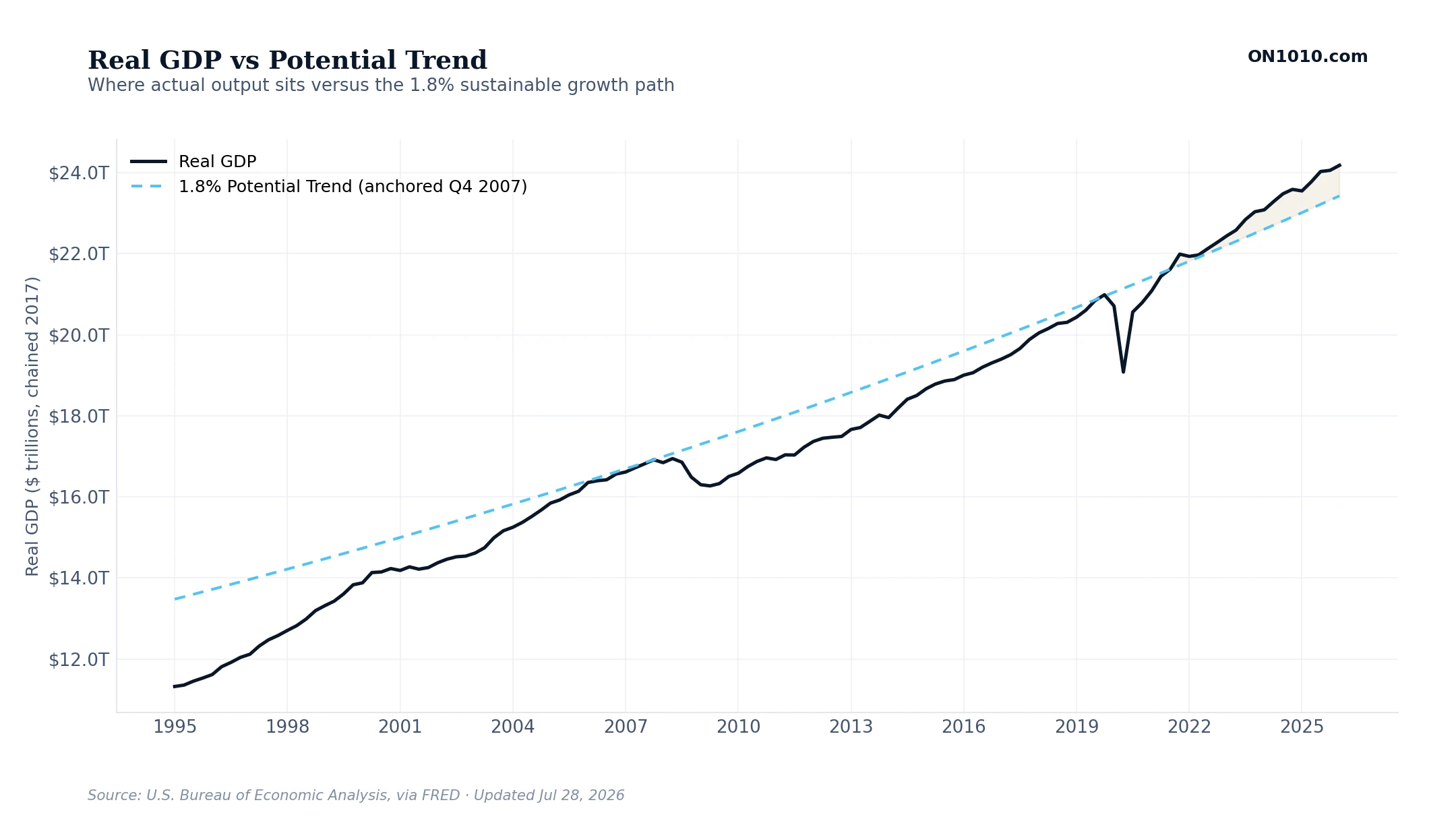
What this measures
The size of the US economy compared to where it should be. GDP stands for Gross Domestic Product, the total value of everything the country produces in a year. The dark line is real GDP, which strips out inflation so you can see actual growth. The dashed light blue line is the trend, growing at 1.8 percent per year from the late-2007 peak. Why 1.8 percent? That is roughly the sustainable speed of the US economy, given the size of the workforce and how productive workers are. The gold-shaded area shows the months when the actual economy was running above trend.
How to read it
When real GDP runs above the trend line for a long stretch, one of two things is happening. Either the economy got more productive (a good thing, often driven by new technology), or the economy is running hot and is heading for a correction. When real GDP runs below trend, there is slack in the economy and the Fed is usually still trying to support growth. The gap between the dark line and the dashed line is the cleanest single read on whether the economy is running too hot, too cold, or just right.
Macro Framework
The Yen Carry Trade Gauge
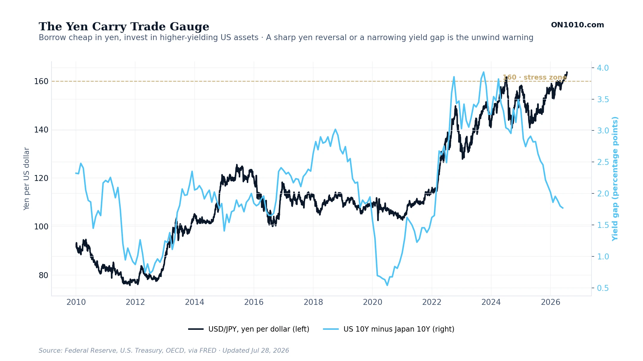
What this measures
The yen carry trade is one of the biggest hidden forces in global markets. For years, money has been borrowed cheaply in Japan, where interest rates are very low, and moved into the United States, where it can earn more. The top measure here is USD/JPY, the number of Japanese yen it takes to buy one US dollar. A higher number means a weaker yen, which keeps the trade attractive. The second measure is the gap between the US 10-year government bond yield and Japan’s 10-year yield. That gap is the reward for moving the money.
How to read it
When the yen is weak and the yield gap is wide, the carry trade is on, and that flow of borrowed money helps support US asset prices. The risk is a sudden reversal. If the yen strengthens sharply, or the yield gap narrows, the trade stops working and money can rush back to Japan all at once. That kind of unwind can drain liquidity from US markets quickly and rattle prices well beyond Japan. The gold line at 160 marks a level where stress has built up before. Watch for a fast move in the yen, not a slow drift. This is also why the carry trade matters for stock prices, not just the yen. That same cheap, borrowed money often ends up in US stocks, so when the trade is on it is a quiet tailwind for the market, and when it unwinds the selling hits stocks fast. In August 2024 the Bank of Japan raised rates, the yen jumped, and the unwind helped set off a sharp global stock drop in a matter of days, even though nothing had changed in the US economy. So treat this as a regime signal for risk, not a day-to-day predictor: a stable or weak yen with a wide gap is supportive, while a fast yen reversal toward the stress zone has repeatedly lined up with stock-market drawdowns.
Market vs the Fed
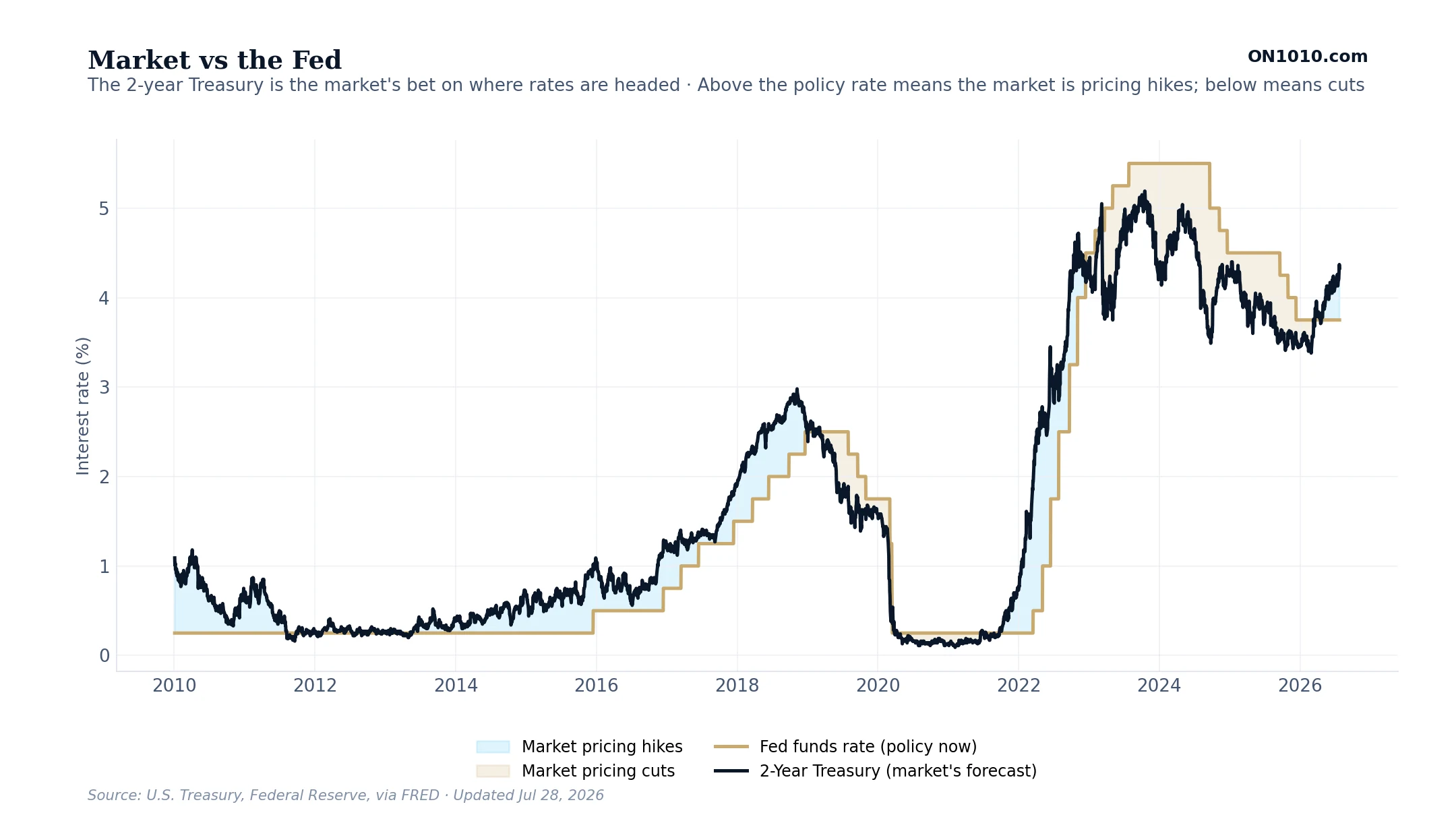
What this measures
This compares what the Federal Reserve is doing now with what the market expects it to do next. The gold line is the current fed funds rate, the Fed’s main policy rate, which the Fed sets. The dark line is the 2-year Treasury yield. Because a 2-year bond covers the next two years, its yield is the market’s best guess of where the Fed’s rate is headed over that time.
How to read it
When the dark 2-year line sits above the gold policy line, the market is betting rates will rise, it is pricing in hikes. When the 2-year drops below the policy rate, the market is pricing in cuts. The size of the gap shows how strong that conviction is. Watch the turns. The 2-year usually moves before the Fed does, so a sharp change in this gap is often the earliest sign that the rate cycle is about to shift.
The Fed’s Real Policy Rate
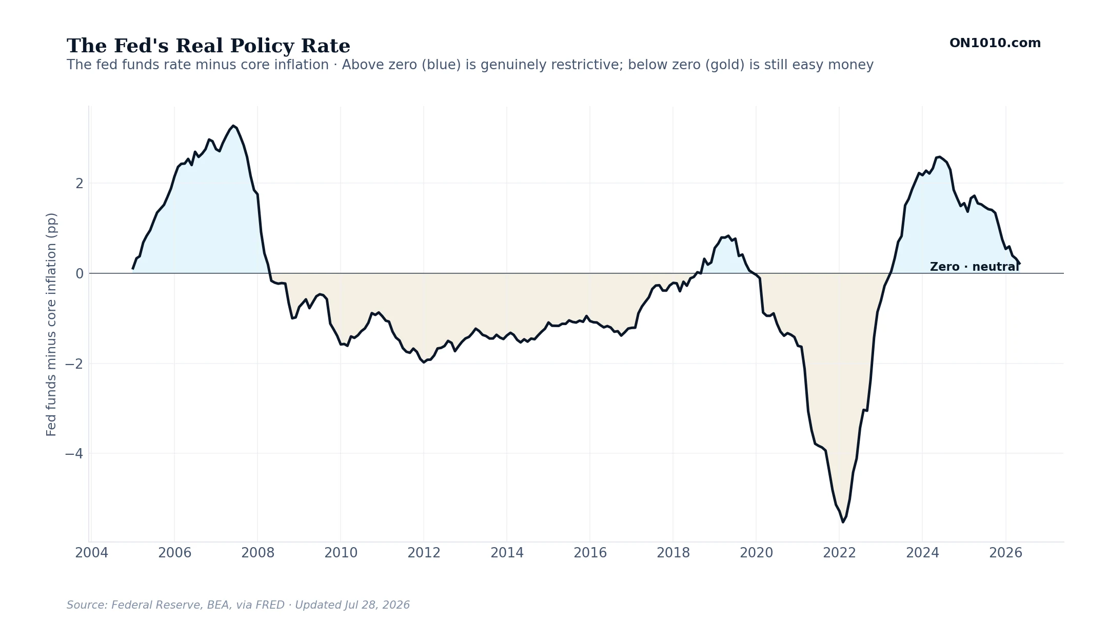
What this measures
This shows how restrictive the Federal Reserve’s policy really is, after accounting for inflation. It takes the fed funds rate and subtracts core inflation, the Fed’s preferred measure, which leaves out food and energy. A 5 percent policy rate means something very different when inflation is 6 percent than when inflation is 2 percent. This real rate cuts through that.
How to read it
Above zero, the blue area, means the Fed is charging more than inflation, genuinely tight policy that leans against growth. Below zero, the gold area, means money is still effectively cheap even if the headline rate looks high. The higher the line climbs above zero, the harder policy is pressing on borrowing, hiring, and spending. When it falls back toward or below zero, policy is loosening its grip, whatever the Fed is saying out loud.
Sectoral Balances
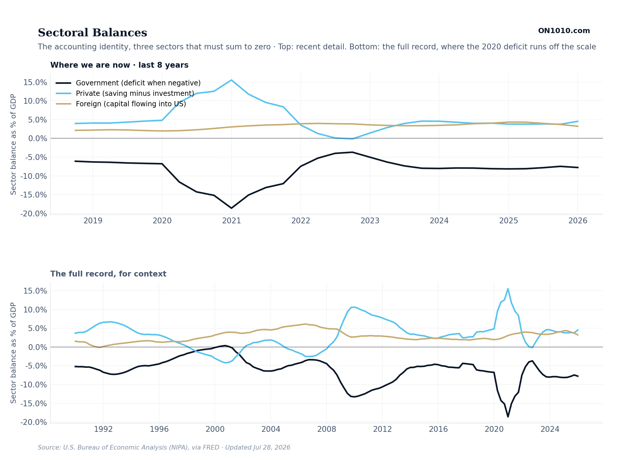
What this measures
A money-flow framework for the whole US economy, broken into three sectors. The government balance is positive when the government runs a budget surplus and negative when it runs a deficit. The private balance is the businesses and households inside the US together. It is positive when they save more than they invest. The foreign balance is positive when foreigners send more money into the US than they take out. These three numbers always add up to zero. That is not opinion, it is math. Every dollar one sector saves has to be a dollar another sector borrows. Each balance is shown as a share of GDP.
How to read it
The key idea is that you cannot change one balance without changing the other two. When the government runs big deficits (the line goes deeply negative), either the private sector has to save more, or foreigners have to send more money into the US, or both. If you think the government’s deficit is going to shrink in the next few years, you have to also expect either private savings to fall or foreign money inflows to slow. Forecasting any one of these three is really forecasting all three at once.