
ON1010 Research Guide
Yield Curve Explained
What the yield curve tells you about recession risk, rate expectations, and market sentiment.
The yield curve is a graph that plots Treasury yields across different maturities, from short-term bills (1 month) to long-term bonds (30 years). Its shape tells you what bond investors collectively expect about the future — economic growth, inflation, and Federal Reserve policy. No single indicator has a better track record of forecasting recessions, and every serious investor should understand what the curve is saying at any given moment.
Key concept: The yield curve shows the relationship between interest rates and time. In normal conditions, longer-term bonds pay higher yields than shorter-term ones because investors demand extra compensation for locking up their money longer. When this relationship breaks down, it usually means something important is changing in the economy.
What a Normal Yield Curve Looks Like
A “normal” or “positive” yield curve slopes upward from left to right — short-term rates are lower than long-term rates. This makes intuitive sense: if you lend money for 10 years instead of 3 months, you face more uncertainty (inflation might rise, the borrower’s situation might change, you can’t use that money for a decade), so you demand a higher interest rate as compensation.
In a healthy economy with moderate growth expectations and stable inflation, you’d typically see the 2-year Treasury yielding less than the 5-year, which yields less than the 10-year, which yields less than the 30-year. The steepness of the curve — how much higher long rates are compared to short rates — varies, but the upward slope is the default state.
What a Steep Curve Signals
A steep yield curve (large gap between short and long rates) often appears early in economic recoveries. The Fed keeps short-term rates low to stimulate growth, but long-term yields rise as investors anticipate stronger economic activity and potentially higher inflation ahead. A steep curve is generally considered bullish for the economy. Banks particularly benefit because they borrow at short-term rates and lend at long-term rates — a steeper curve means wider profit margins on loans.
What a Flat Curve Signals
A flat yield curve (small gap between short and long rates) typically develops during the middle-to-late stages of an economic expansion. The Fed has been raising short-term rates to prevent overheating, pushing the front end of the curve higher. Meanwhile, long-term rates may not rise as much because investors are starting to question how much longer the expansion can continue. A flat curve is a warning light — not an alarm, but something to watch closely.
What Yield Curve Inversions Signal
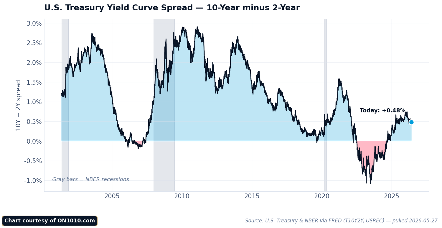
An “inverted” yield curve occurs when short-term yields exceed long-term yields — the curve slopes downward instead of upward. The most-watched measure is the “2s/10s spread”: the 10-year Treasury yield minus the 2-year Treasury yield. When this number goes negative, the curve is inverted.
Why Inversions Are the Gold Standard Recession Indicator
An inverted 2s/10s spread has preceded every U.S. recession since 1970, with a lead time ranging from about 6 to 24 months. No other single indicator has this kind of track record. The logic is straightforward: when investors accept lower yields on 10-year bonds than on 2-year bonds, they’re signaling that they expect the Fed will need to cut rates significantly in the future — and the most common reason for aggressive rate cuts is a recession.
The inversion also reflects a belief that current monetary policy is too tight. High short-term rates (set by the Fed) are expected to slow the economy enough that long-term growth and inflation expectations fall below current short-term rates.
The 2022–2024 Inversion: A Historic Case Study
The yield curve inverted in mid-2022 as the Fed aggressively raised rates to fight inflation, and it stayed inverted for a historically long stretch — over two years. The 2-year yield climbed above 5% while the 10-year stayed in the 3.5–4.5% range. This was one of the deepest inversions in decades, yet the widely predicted recession didn’t arrive on the typical timeline. The labor market remained strong, consumer spending held up, and GDP growth continued.
This episode taught investors an important lesson: the yield curve signals that recession risk is elevated, but it doesn’t tell you exactly when — or guarantee — a downturn will arrive. The unprecedented nature of the post-COVID economy (massive fiscal stimulus, distorted supply chains, lingering savings buffers) likely delayed the typical transmission mechanism.
Other Yield Curve Measures
While the 2s/10s spread gets the most attention, analysts also watch:
The 3-month/10-year spread: Some economists prefer this measure because the 3-month T-bill rate more directly reflects current Fed policy (rather than market expectations of future policy). The New York Fed’s recession probability model uses this spread. It also inverted during 2022–2023 and produced some of its most extreme negative readings in 40 years.
The near-term forward spread: This compares the current 3-month T-bill rate to the market’s expectation of the 3-month rate 18 months forward. Fed researchers have argued this measure captures the yield curve’s recession-forecasting power more precisely than either the 2s/10s or 3-month/10-year spreads.
Why the Yield Curve Matters for Investors
The yield curve’s shape has practical implications across asset classes:
Impact on Bank Stocks and Financials
Banks earn money on the “net interest margin” — the gap between what they pay depositors (tied to short-term rates) and what they charge borrowers (tied to longer-term rates). A steep yield curve means wider margins and fatter profits. A flat or inverted curve squeezes those margins, which is why bank stocks often underperform when the curve flattens. Regional banks are particularly sensitive because they rely more heavily on traditional lending than large diversified banks.
Impact on Growth vs. Value Stocks
A steepening curve (driven by rising long-term rates) tends to favor value stocks — banks, industrials, energy companies — over growth stocks. That’s because higher long-term rates increase the discount rate applied to distant future earnings, which hurts companies valued primarily on future growth potential (technology, biotech). Conversely, a flattening curve often coincides with growth stock outperformance as investors seek companies that can grow regardless of the economic cycle.
Impact on Housing
Mortgage rates track the 10-year Treasury yield, so the curve’s shape directly affects housing affordability. An inverted curve can create an unusual situation where long-term mortgage rates are lower than short-term borrowing costs, which can actually stimulate refinancing activity even as the broader economy faces headwinds.
Impact on Bond Portfolio Strategy
The curve’s shape determines whether it pays to extend duration (buy longer-maturity bonds). In a steep curve environment, longer bonds offer meaningfully more yield, rewarding investors for taking duration risk. In a flat or inverted curve, short-term bonds offer comparable or better yields with less interest rate risk — a signal to keep duration short until the curve normalizes.
Reading the Yield Curve in Real Time
Here’s how to interpret common yield curve scenarios:
Steepening from flat/inverted (“bull steepener”): Short-term yields fall faster than long-term yields. This typically happens when the Fed starts cutting rates. It can signal the beginning of a new economic cycle — historically a good time for risk assets, though the early stages often coincide with economic weakness.
Steepening from flat/inverted (“bear steepener”): Long-term yields rise faster than short-term yields. This can signal rising inflation expectations or concerns about fiscal sustainability (too much government borrowing). It’s less benign than a bull steepener because it means borrowing costs are rising across the economy.
Flattening (“bear flattener”): Short-term yields rise faster than long-term yields, usually because the Fed is raising rates. This is the typical late-cycle pattern that precedes inversions.
Parallel shift up: All yields rise together, preserving the curve’s shape. This usually reflects broadly rising inflation expectations or a general repricing of the “neutral” interest rate.
Common Misconceptions About the Yield Curve
“The yield curve causes recessions”
The yield curve doesn’t cause recessions — it reflects the market’s assessment of conditions that typically lead to recessions. An inverted curve signals that monetary policy is restrictive and likely to slow economic growth. The recession itself is caused by the underlying dynamics (tight credit, reduced investment, consumer pullback), not by the curve shape.
“Once the curve un-inverts, the danger is over”
Actually, the opposite is closer to the truth. Historically, recessions have often started after the curve has already un-inverted (re-steepened). The un-inversion typically happens because the Fed starts cutting rates in response to deteriorating economic data — meaning the recession may already be arriving or imminent.
“This time is different”
Every inversion cycle produces arguments for why the signal no longer applies — quantitative easing has distorted term premiums, foreign demand has compressed long-term yields, the post-COVID economy is unique. Some of these arguments have merit (the 2022–2024 inversion was influenced by unusual factors). But dismissing the signal entirely has historically been a mistake. The yield curve may not be infallible, but ignoring it means ignoring the single best recession forecasting tool available.
Frequently Asked Questions
How long after an inversion does a recession typically start?
Historically, recessions have begun 6 to 24 months after the initial 2s/10s inversion. The average lead time is roughly 12–18 months, but there’s significant variation. The 2019 inversion preceded the 2020 recession by about 7 months (though COVID was the proximate cause). The 2006 inversion preceded the 2008 financial crisis by about 23 months.
Can the yield curve give false signals?
There have been brief, shallow inversions that were not followed by recessions — notably in 1998 during the Long-Term Capital Management crisis. However, sustained inversions (lasting more than a few weeks) have an extremely strong track record. The depth and duration of the inversion matter more than whether it technically occurred.
Where can I check the current yield curve?
The U.S. Department of the Treasury publishes daily yield curve rates at treasury.gov. The Federal Reserve Bank of St. Louis (FRED) provides historical data and charts. ON1010’s daily Treasury Market Guide tracks current yield levels and curve dynamics as part of our regular economic analysis.
Does the yield curve work the same way in other countries?
Yield curve inversions have some predictive power in other developed economies (UK, Germany, Canada, Australia), but the track record is most robust for U.S. Treasuries. This is partly because the U.S. has the deepest, most liquid bond market and partly because the dollar’s role as global reserve currency means U.S. yields reflect global capital flows, not just domestic conditions.
How does the Fed’s balance sheet affect the yield curve?
Quantitative easing (QE) — when the Fed buys long-term bonds — pushes down long-term yields and flattens the curve artificially. Quantitative tightening (QT) has the opposite effect: it lets long-term yields rise, which can steepen the curve. This means the yield curve’s signal may be distorted during periods of active Fed balance sheet operations. Analysts try to adjust for this by estimating the “term premium” component of long-term yields.
What should I do with my portfolio when the curve inverts?
An inversion doesn’t mean you should panic-sell stocks — remember, the lag time can be 6 to 24 months, and markets can rally significantly during that window. However, an inversion is a signal to review your risk exposure. Consider whether your portfolio is appropriately diversified, whether your emergency fund is adequate, and whether you’re comfortable with your allocation to cyclical sectors that tend to suffer most in downturns (consumer discretionary, financials, industrials). Many advisors suggest gradually shifting toward more defensive positioning rather than making dramatic changes.
What is the “term premium” and how does it affect the yield curve?
The term premium is the extra compensation investors demand for holding longer-dated bonds instead of rolling over short-term bills. It reflects uncertainty about future inflation and interest rates. When the term premium is high, the curve appears steeper than economic fundamentals alone would suggest. When it’s low or negative (as it was for much of the 2010s due to QE), the curve appears flatter. The New York Fed publishes a term premium estimate that helps analysts separate the “expectations” component of yields from the “risk compensation” component. Understanding this distinction is crucial for correctly interpreting the curve’s signal.
Stay Ahead of the Data
Get free daily economic analysis delivered to your inbox. Our AI-powered briefings break down the data that moves markets — in plain English.