
ON1010 Research Guide
Inflation Indicators Explained
Every inflation metric investors need to track — what each one measures, how they connect, and which ones actually drive Fed policy.
Inflation is the single most important variable in financial markets today. It determines when the Federal Reserve raises or cuts interest rates, which in turn affects everything from mortgage rates and bond prices to stock valuations and the dollar. But “inflation” isn’t just one number — it’s measured by a family of indicators, each capturing a different slice of price pressure in the economy. Understanding the full landscape of inflation metrics gives you a much clearer picture than watching any single report.
Key concept: Different inflation indicators measure prices at different stages of the economy. Producer prices capture costs at the wholesale level. Consumer prices capture what you pay at the register. Import prices capture cost pressures from abroad. Each one tells a different part of the inflation story, and together they form a pipeline: rising producer costs today often become rising consumer prices tomorrow.
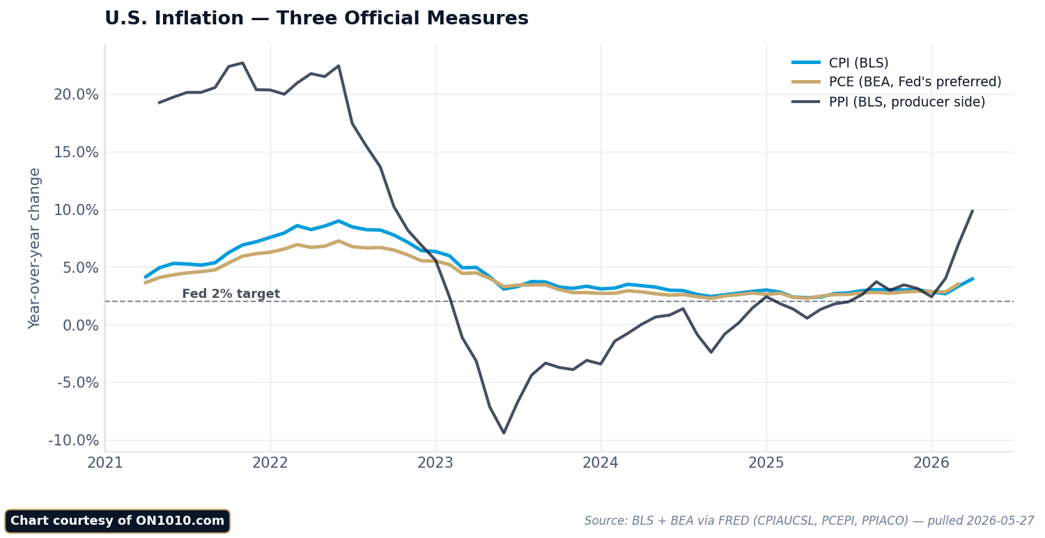
The Big Three: CPI, PCE, and PPI
Three inflation reports dominate market attention. Each has a different purpose, methodology, and audience — but they’re all measuring the same underlying phenomenon: whether prices across the economy are rising, falling, or holding steady.
Consumer Price Index (CPI)
Source: Bureau of Labor Statistics (BLS)
Frequency: Monthly (typically the second or third week, 8:30 AM ET)
Key metrics: Headline CPI (all items), core CPI (excluding food and energy), month-over-month and year-over-year changes
CPI measures price changes from the consumer’s perspective — what households actually pay for a fixed basket of goods and services including housing, food, transportation, medical care, and recreation. It’s the most widely followed inflation indicator and typically generates the largest market reaction of any inflation report. For a detailed breakdown of how CPI works, its components, and market impact, see our CPI Explained guide.
CPI uses a fixed basket that’s updated periodically but doesn’t fully account for consumers switching to cheaper alternatives when prices rise. This “substitution bias” is one reason CPI tends to run slightly higher than the PCE price index. Housing costs (measured through “owners’ equivalent rent”) make up roughly one-third of the CPI basket, which means shelter inflation has an outsized impact on the headline number.
Personal Consumption Expenditures (PCE) Price Index
Source: Bureau of Economic Analysis (BEA)
Frequency: Monthly (typically the last week of the month, 8:30 AM ET)
Key metrics: Headline PCE, core PCE (excluding food and energy), month-over-month and year-over-year changes
Core PCE is the Federal Reserve’s officially preferred inflation measure — the 2% target that drives monetary policy refers specifically to this index. PCE differs from CPI in three important ways. First, it uses a broader basket of goods and services, including items paid for by employers and government (like employer-provided health insurance). Second, it accounts for substitution effects, meaning it adjusts when consumers shift spending toward cheaper alternatives. Third, it weights categories differently — notably, housing has a lower weight in PCE than in CPI.
Because PCE accounts for substitution and uses a broader basket, it typically runs 0.3 to 0.5 percentage points below CPI. This isn’t a flaw in either measure — they’re answering slightly different questions. CPI asks “how much more does the same basket cost?” while PCE asks “how much more are consumers actually spending after adjusting their behavior?”
Producer Price Index (PPI)
Source: Bureau of Labor Statistics
Frequency: Monthly (typically the week before CPI)
Key metrics: Final demand PPI, core PPI (excluding food, energy, and trade services)
PPI measures price changes at the wholesale level — what producers receive for their output before it reaches consumers. Think of PPI as an upstream indicator: it captures cost pressures that haven’t yet been passed through to retail prices. Rising PPI can foreshadow CPI increases because businesses eventually push higher input costs onto customers, though the pass-through isn’t always one-for-one or immediate.
Traders use PPI as a preview of the upcoming CPI report, and several PPI components feed directly into the PCE price index calculation. The “core PPI excluding trade services” reading strips out the most volatile elements and gives the cleanest read on underlying wholesale inflation trends.
CPI vs. PCE: Why They Differ and Why It Matters
The gap between CPI and PCE is more than academic — it has real implications for policy and markets. Here are the key differences:
Basket composition: CPI measures out-of-pocket spending by urban consumers. PCE measures all consumer spending, including items paid on behalf of consumers (employer health insurance, Medicare, Medicaid). This makes PCE’s basket roughly 25% larger.
Weighting method: CPI uses fixed weights updated every two years. PCE uses chain-weighted calculations that update monthly, capturing real-time shifts in spending patterns. When gas prices spike and consumers drive less, PCE reflects that behavioral change faster than CPI.
Housing weight: Shelter accounts for about 36% of CPI but only about 15% of PCE. This means that when rent and housing costs are the primary inflation driver (as they were through much of 2023–2024), CPI tends to run meaningfully hotter than PCE.
Healthcare measurement: CPI measures what consumers pay out of pocket for healthcare. PCE includes total healthcare spending, including the portions covered by employers and government programs. Healthcare is a much larger share of PCE than CPI.
Why the Fed chose PCE: The Fed prefers PCE because its chain-weighting methodology better reflects actual consumer behavior, its broader coverage captures more of the economy, and it’s less distorted by the housing component. However, CPI remains more market-moving because it’s released earlier in the month and has a longer public track record.
Other Inflation Measures Worth Watching
Beyond the Big Three, several other indicators help round out the inflation picture. No single metric tells the whole story, and experienced investors track multiple gauges to distinguish between temporary price spikes and genuine inflationary trends.
Import and Export Price Indexes
Source: Bureau of Labor Statistics
Frequency: Monthly
Import prices measure the cost of goods and services purchased from abroad. Rising import prices — driven by a weaker dollar, higher commodity costs, or tariffs — can feed into domestic consumer inflation. Export prices, meanwhile, signal how competitive U.S. goods are globally. During periods of trade policy uncertainty or currency volatility, import prices become an important leading indicator for future CPI readings.
Employment Cost Index (ECI)
Source: Bureau of Labor Statistics
Frequency: Quarterly (last week of January, April, July, October)
The ECI measures changes in total labor compensation — wages plus benefits. The Fed watches this closely because labor costs are the largest expense for most businesses, and sustained wage growth above productivity gains creates persistent inflation pressure. Unlike average hourly earnings from the monthly jobs report, the ECI controls for shifts in the mix of jobs (so it’s not distorted by, say, a surge in low-wage hiring that pulls down the average). ECI is considered a more accurate measure of true wage inflation.
Breakeven Inflation Rates
Source: Treasury market (calculated from TIPS vs. nominal Treasury yields)
Available: Real-time during market hours
Breakeven inflation rates represent what the bond market expects inflation to average over a given period. They’re calculated by subtracting the TIPS yield from the nominal Treasury yield of the same maturity. For example, if the 10-year Treasury yields 4.5% and the 10-year TIPS yields 2.0%, the 10-year breakeven is 2.5% — meaning the bond market expects inflation to average 2.5% annually over the next decade. See our Treasury Market Guide for more on TIPS and breakeven rates.
Breakeven rates are useful because they’re forward-looking (unlike CPI and PCE, which report what already happened) and they update in real time. The Fed monitors breakevens as a gauge of whether long-term inflation expectations remain “anchored” near 2%.
University of Michigan Inflation Expectations
Source: University of Michigan Survey of Consumers
Frequency: Monthly (preliminary mid-month, final end-of-month)
This survey asks consumers what they expect inflation to be over the next year and over the next 5–10 years. The Fed pays close attention to the 5-year expectations reading because if consumers expect high inflation to persist, they may change their behavior in ways that actually cause inflation to persist — demanding higher wages, accepting higher prices, and spending sooner rather than later. This is the concept of “unanchored” inflation expectations, and it’s one of the Fed’s biggest fears.
GDP Price Deflator
Source: Bureau of Economic Analysis
Frequency: Quarterly (released with GDP data)
The GDP deflator measures price changes across the entire economy — not just consumer goods, but also government spending, business investment, and exports. It’s the broadest inflation gauge available but gets less market attention because it’s only released quarterly and is somewhat buried inside the GDP report. The GDP deflator is useful for understanding whether the economy’s total output growth is being driven by real production increases or just price inflation.
The Inflation Pipeline: How Price Pressures Flow Through the Economy
Inflation doesn’t appear all at once. It flows through a predictable pipeline, and tracking each stage helps you anticipate where consumer prices are headed:
Stage 1 — Raw materials and commodities: Oil, metals, agricultural products, and other raw inputs are the first to move. Commodity price indexes (like the Bloomberg Commodity Index) signal cost pressures at the earliest stage. These show up in import prices and the crude goods component of PPI.
Stage 2 — Producer prices: As raw material costs rise, manufacturers and producers pay more for inputs. PPI captures this stage. Not all cost increases get passed through — companies may absorb some through lower margins — but sustained PPI increases eventually flow downstream.
Stage 3 — Consumer prices: Businesses pass higher costs to consumers through retail prices, reflected in CPI and PCE. The lag from producer to consumer prices varies by industry — grocery prices adjust within weeks, while manufacturing goods may take months.
Stage 4 — Wages: As consumer prices rise, workers demand higher pay to maintain purchasing power. This shows up in average hourly earnings and the ECI. Higher wages then become higher costs for employers, potentially feeding back into Stage 2 — creating what economists call a “wage-price spiral.”
Understanding this pipeline helps you interpret seemingly contradictory signals. For example, falling PPI alongside still-elevated CPI isn’t contradictory — it means cost pressures are easing upstream but haven’t yet worked through to retail prices. It’s a leading indicator that consumer inflation may cool in coming months.
How Inflation Data Moves Markets
Inflation reports move markets primarily through their impact on Federal Reserve policy expectations. Here’s the transmission mechanism:
Higher-than-expected inflation pushes markets to expect the Fed will keep rates higher for longer (or raise them further). Bond yields rise, stock prices typically fall (especially growth stocks), and the dollar strengthens as higher rates attract foreign capital.
Lower-than-expected inflation has the opposite effect. Markets price in earlier rate cuts, bond yields fall, stocks rally (growth stocks especially), and the dollar weakens.
The “core” reading matters most because the Fed focuses on core inflation (excluding food and energy) to assess underlying price trends. A headline CPI spike driven entirely by a temporary oil shock will move markets less than a core CPI surprise driven by broad-based price increases.
Month-over-month matters more than year-over-year for near-term market moves. The annual rate includes 12 months of data, so it changes slowly. The monthly rate shows the most recent price change and signals whether inflation is accelerating or decelerating right now. Traders often annualize the 3-month average of core readings to gauge the current inflation “run rate.”
Frequently Asked Questions
Which inflation number does the Fed actually target?
The Fed targets a 2% annual rate on the core PCE price index. This is the number that appears in the Fed’s Summary of Economic Projections and drives rate decisions. CPI gets more headlines and bigger market reactions because it’s released earlier, but PCE is the official policy target.
Why is core inflation more important than headline inflation?
Core inflation excludes food and energy prices because they’re highly volatile and often driven by temporary supply shocks (a hurricane, an OPEC decision, a drought) rather than underlying economic conditions. The Fed can’t control oil prices or food costs with interest rates, so it focuses on core inflation to assess whether its monetary policy is working. That said, if food and energy prices stay elevated long enough, they can feed into core inflation through higher transportation costs, restaurant prices, and other indirect channels.
What is “sticky” vs. “flexible” inflation?
The Atlanta Fed divides CPI components into “sticky” prices (items that change infrequently, like rent, insurance, medical care, and education) and “flexible” prices (items that change often, like gas, food, airfares, and used cars). Sticky inflation is more important for the Fed because it reflects pricing decisions that are harder to reverse and tend to persist. When sticky inflation is elevated, it suggests that disinflation will be slow even if flexible prices are falling.
How can inflation be high when prices are falling on some things?
Inflation is a weighted average across hundreds of categories. Some prices can fall (electronics, used cars, some commodities) while others rise enough (rent, insurance, services) to push the overall index higher. This is why looking at breadth — the share of categories showing price increases — matters as much as the headline number. Broad-based inflation (many categories rising) is more concerning than concentrated inflation (one or two categories driving the number).
What inflation rate should investors actually worry about?
The level that triggers sustained Fed tightening. Core PCE running consistently above 3% keeps the Fed in “higher for longer” mode. Core PCE between 2% and 2.5% is a comfortable zone where the Fed can consider easing. Below 2% could signal demand weakness. For markets, the direction and momentum of inflation matter as much as the absolute level — inflation falling from 4% to 3% is bullish even though 3% is above target, because the trajectory suggests the Fed can start thinking about cuts.
How do tariffs affect inflation readings?
Tariffs raise import prices, which flow through to producer prices and eventually consumer prices. The impact typically appears in CPI within 3–6 months of implementation, though the size depends on whether importers, retailers, or consumers absorb the cost. Tariff-driven inflation presents a dilemma for the Fed: it raises prices (arguing for higher rates) but can also slow economic growth (arguing for lower rates). The Fed generally treats tariff effects as one-time price level adjustments rather than ongoing inflation, unless they trigger broader price increases or wage demands.
Stay Ahead of the Data
Get free daily economic analysis delivered to your inbox. Our AI-powered briefings break down the data that moves markets — in plain English.