
ON1010 RESEARCH GUIDE
Understanding the Consumer Price Index
What CPI measures, how inflation is calculated, and why rising prices matter for your investments and daily life.
The Consumer Price Index (CPI) tracks the average change in prices that households pay for goods and services over time, acting as the most widely watched measure of inflation in the United States. This single number influences everything from your Social Security benefits to the interest rates on your mortgage. When economists study consumer price changes, they’re trying to understand whether your dollar buys more or less than it did last month, last year, or last decade.
The story gets more interesting when you look under the hood. You’ll discover how government statisticians track thousands of items, why different versions of CPI exist, and how outlet substitution affects measured price growth. Understanding these details helps you interpret headlines about inflation and make better decisions about your money.
Consumer Price Index Explained: What CPI Really Measures
The Consumer Price Index measures price changes for a fixed basket of goods and services that urban households buy. The index reveals how much more or less you pay for everyday items compared to a base period set at 100.
Defining the Consumer Price Index
What is the Consumer Price Index? It tracks the average change in prices you pay for a market basket of items over time. Think of it as a shopping cart filled with specific goods and services that stays constant while prices fluctuate around it.
The basket includes eight major categories:
- Food and beverages
- Housing
- Apparel
- Transportation
- Medical care
- Recreation
- Education and communication
- Other goods and services
The Bureau of Labor Statistics collects prices throughout each month from urban areas. These prices reflect your out-of-pocket costs, including sales and excise taxes. The current base period sits at 1982-84, when the index equals 100.
If today’s index reads 300, you’re paying roughly three times what households paid in the base period for that same basket. The percentage change tells you the inflation rate.
Core Principles of CPI Measurement
The CPI follows a two-stage calculation process. First, the Bureau creates basic indexes for specific item and area combinations, like ice cream prices in Chicago. Second, these basic indexes roll up into broader measures until you reach the all items U.S. city average.
The CPI covers over 90 percent of the U.S. population through the CPI-U (all urban consumers). Rural households, farm families, military installations, and institutional populations fall outside the scope.
You’ll notice the CPI excludes several categories. Investment items like stocks, bonds, and real estate don’t count because they represent wealth building rather than consumption. Life insurance gets excluded, though health and auto insurance stay in. Interest costs and finance charges remain out of scope entirely.
The index treats taxes differently depending on type. Sales taxes and excise taxes factor into your measured costs. Income taxes don’t. Tariffs affect prices indirectly when producers adjust pricing in response to import cost changes, but predicting these effects precisely remains difficult.
Inside the Basket: How CPI Is Calculated
The Consumer Price Index tracks price changes through a carefully selected basket of goods and services, weighted by how much households actually spend. Your government collects thousands of prices each month and adjusts them for quality changes to measure what inflation really means for your wallet.
The Role and Selection of the Basket of Goods
Think of the CPI basket as a snapshot of what urban consumers buy. The Bureau of Labor Statistics divides everything into more than 200 categories across eight major groups.
Food and beverages cover your breakfast cereal and restaurant meals. Housing includes rent and utilities. Apparel tracks clothing prices from baby clothes to jewelry.
Transportation measures new vehicles and gasoline. Medical care includes prescription drugs and hospital services. Recreation covers everything from televisions to museum admissions.
Education and communication track college tuition and phone services. Other goods and services include haircuts and funeral expenses. The basket excludes investments like stocks and real estate because you’re not consuming them.
You won’t find illegal goods, home production, or life insurance in the basket either. The CPI measures consumer spending, not investment or business expenses.
CPI Weighting and Spending Patterns
Here’s where it gets interesting: not every item in the basket counts equally. The CPI weights each category based on what share of your budget it typically consumes.
If urban households spend 15% of their budget on food, then food price changes get a 15% weight in the overall index. Housing carries the heaviest weight because you spend the most there. Coffee price changes matter less than rent changes because rent takes a bigger bite.
These weights come from actual spending surveys of urban consumers, who represent over 90% of the population. Farm households, military personnel on base, and people in institutions don’t factor into the calculation.
The weights shift over time as your spending patterns change. What you bought in 1985 looks different from what you buy today. This creates a puzzle: should the index track a fixed basket or adjust as you substitute cheaper alternatives when prices rise?
Data Collection and Adjustments
Your government employs people who visit stores and collect actual prices throughout each month. They gather data during three separate pricing periods to capture the full month’s activity.
The process works in two stages. First, basic indexes calculate price changes for specific item and area combinations, like ice cream prices in Chicago. Second, these basic indexes roll up into broader measures.
Quality adjustments add complexity to what seems simple. When a new smartphone costs the same as last year’s model but has better features, that’s not pure inflation. The BLS adjusts for quality improvements so you’re comparing equivalent value.
Seasonal adjustment removes predictable patterns like higher hotel prices in summer. This helps you see underlying trends versus normal seasonal swings. The base period of 1982 to 1984 equals 100, so today’s index values show how much prices have changed since then.
Breaking Down CPI: Core vs Headline Measures
The Bureau of Labor Statistics publishes two versions of CPI each month: one that includes everything consumers buy, and one that strips out the most volatile categories. Understanding why both measures exist helps you interpret inflation data more clearly.
Headline CPI and Its Limitations
Headline CPI tracks the full basket of goods and services that urban consumers purchase. It includes everything: groceries, gasoline, rent, healthcare, and all other spending categories.
The problem is volatility. Food and energy prices swing dramatically from month to month based on weather, geopolitical events, and supply disruptions. A hurricane that damages oil refineries can spike gas prices 20% in weeks. A drought can double lettuce costs overnight.
These sharp moves make it harder to see the underlying inflation trend. You might see headline CPI jump 0.8% one month and fall 0.2% the next, not because the broader economy changed, but because oil prices bounced around.
For policymakers trying to set interest rates, that noise creates problems. They need to distinguish between temporary price spikes and persistent inflation that requires action.
Core CPI: Why Food and Energy Are Excluded
Core CPI removes food and energy prices entirely from the calculation. The Bureau of Labor Statistics constructs this measure monthly by excluding these volatile categories and reweighting the remaining items.
The logic is straightforward: food and energy prices change frequently based on temporary factors, while other prices tend to change less often and reflect more persistent economic forces. Economists call prices that change infrequently “sticky” because they respond more to fundamental inflation pressures.
This doesn’t mean food and energy costs don’t matter to your budget. They absolutely do. But for measuring the inflation trend that monetary policy can actually influence, core CPI often provides clearer signals.
The tradeoff is obvious: core CPI ignores categories that represent a significant chunk of your spending. That makes it less relevant for understanding your personal cost of living, even if it’s more useful for economic analysis.
Comparing Core and Headline Trends
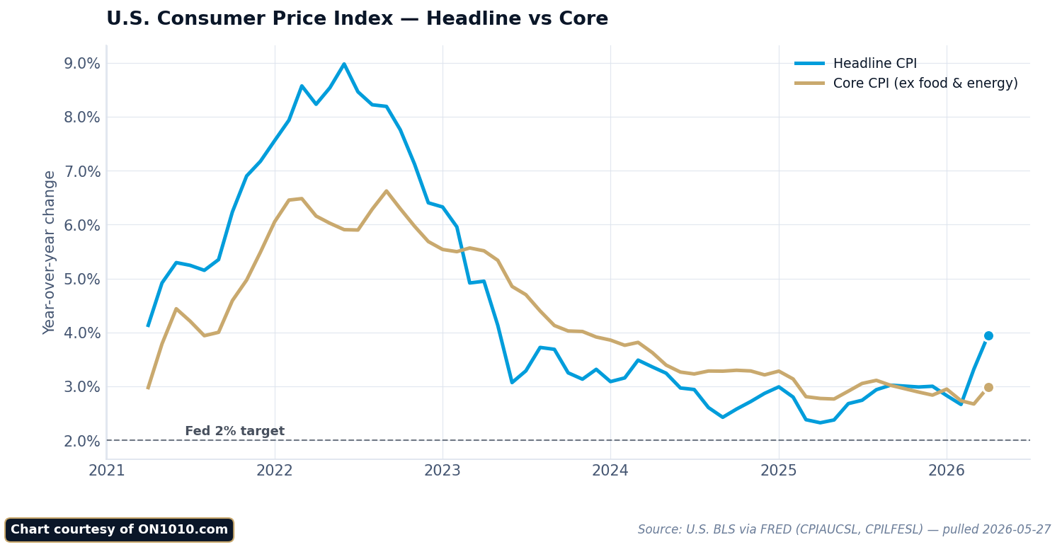
Core vs headline CPI typically show different readings. When oil prices surge, headline inflation jumps above core. When energy costs fall, headline drops below core.
Over longer periods, the two measures tend to converge. The temporary swings in food and energy average out, and both indexes reflect similar underlying inflation rates. But in any given month or quarter, the gap can be substantial.
You need both measures to get the full picture. Headline CPI tells you what’s actually happening to consumer costs right now. Core CPI reveals whether inflation pressures are building or fading beneath the surface volatility.
Financial markets often react more strongly to core CPI surprises because that’s what the Federal Reserve watches most closely when setting policy. But headlines about inflation usually focus on the headline number because it matches what people experience at the pump and grocery store.
Reading and Interpreting CPI Data: A Practical Guide
The monthly CPI report contains specific numbers that reveal how prices are changing across different categories. Understanding the index level, percentage changes, and category breakdowns helps you see which parts of the economy are experiencing the fastest price movements.
Key Metrics in the Monthly CPI Report
When you look at the monthly CPI report, you’ll see several numbers that each tell a different part of the inflation story.
The index level appears as a number like 310.5. This compares current prices to a baseline period from 1982-84, which equals 100. If the index reads 310.5, prices have roughly tripled since that baseline.
The 1-month percentage change shows how prices moved in the past 30 days. The 12-month change matters more because it smooths out monthly quirks and seasonal patterns.
You’ll also see seasonally adjusted and not seasonally adjusted figures. The adjusted numbers remove predictable seasonal patterns like higher hotel prices in summer. Most analysts focus on seasonally adjusted data for clearer trend reading.
The report breaks down into major categories:
| Category | What It Includes |
|---|---|
| Food and beverages | Groceries, restaurant meals |
| Housing | Rent, utilities, furnishings |
| Transportation | Cars, gas, airfare |
| Medical care | Prescriptions, services |
| Recreation | Hotels, entertainment |
Many economists watch the “core CPI” number closely. This excludes food and energy because those prices jump around from month to month.
How to Read CPI Data Effectively
Start with the 12-month change in the All Items index. This single number gives you the headline inflation rate that affects purchasing power across the economy.
Next, compare the all items figure to the core rate. When core inflation runs higher than the headline number, it suggests broader price pressures beyond volatile categories. When headline exceeds core, energy or food prices are likely driving the increase.
Dig into the category details to understand what’s actually changing. Housing typically makes up about one third of the index weight. Medical care, transportation, and food each carry significant weight too.
Look at both the percentage change and the contribution to overall inflation. A category might show a large percentage increase but contribute little to total inflation if it represents a small slice of consumer spending.
Watch for patterns across multiple months rather than reacting to single data points. Inflation trends emerge over quarters, not weeks. One month of higher prices might reverse; three months suggests something structural is shifting.
Why CPI Matters: Impact on Policymakers, Investors, and Households
The CPI drives decisions that affect your paycheck, your portfolio, and your purchasing power. Central bankers adjust interest rates based on what it reveals about price pressures. Your Social Security check rises or falls according to its movements.
How the Federal Reserve Uses CPI
When you hear about the Federal Reserve raising or lowering interest rates, CPI data informs those decisions. The Fed watches price changes closely because its mandate includes maintaining stable prices alongside maximum employment.
Here’s how it works in practice. When CPI shows prices rising faster than the Fed’s target, policymakers typically raise interest rates to cool spending. Higher rates make borrowing more expensive. This slows down economic activity and reduces demand.
The Fed pays particular attention to core inflation, which strips out food and energy prices. These categories swing wildly based on weather and global events. Core CPI reveals underlying price trends that persist over time.
Your borrowing costs, mortgage rates, and savings account yields all respond to these policy decisions. The connection runs through the entire economy.
CPI’s Role in Investment and Capital Allocation
Capital flows to where it gets treated best, and inflation erodes returns. When you evaluate any investment, you need to consider whether it will outpace CPI growth.
Bonds face direct inflation risk. A 10-year Treasury paying 4% looks attractive until CPI runs at 5%. Your real return turns negative. You lose purchasing power despite earning interest.
Stocks offer more complexity. Some companies pass rising costs to customers and protect margins. Others get squeezed. The difference matters for your portfolio returns.
Real assets like commodities and real estate often perform differently during inflation periods. They can provide protection when paper assets struggle. Policy incentives shape these capital flows as investors seek to preserve wealth.
Your investment strategy needs to account for the inflation environment revealed by CPI data.
Effects on Social Security and Cost of Living Adjustments
Your Social Security benefits adjust annually based on CPI measurements. The government uses CPI to escalate payments for retirees and other beneficiaries.
The formula looks at CPI changes from the third quarter of one year to the third quarter of the next. If prices rose 3%, your benefit rises 3%. This aims to maintain your purchasing power as you age.
Federal tax brackets also shift with CPI. Without these adjustments, inflation would push you into higher tax brackets even if your real income stayed flat. Rents, wages, and various contracts often include escalation clauses tied to CPI movements.
The index touches your financial life whether you track it actively or not. It determines whether your fixed income keeps pace with rising prices or falls behind.
The Real-World Impact: How CPI Shapes Purchasing Power
When prices rise faster than your paycheck, that’s CPI inflation measurement at work in your daily life. The gap between what your dollars bought last year versus today reveals the invisible tax of inflation on your household budget.
CPI and Its Effect on Household Budgets
Think of your monthly budget as a fixed pie. When the CPI rises, each slice of that pie buys less than before.
Your $500 grocery budget might have filled your cart last year. This year, that same $500 leaves you choosing between the name brand cereal or the generic version. That’s purchasing power erosion in action.
The eight major categories tracked by the Bureau of Labor Statistics don’t move in lockstep. Housing costs might jump 6% while apparel stays flat. Medical care could spike 8% as recreation barely budges.
This creates a puzzle for your planning. If you spend more than average on healthcare and those costs are climbing faster than overall CPI, your personal inflation rate exceeds the headline number. The national average reflects millions of different experiences, not your specific situation.
Your budget faces three choices when CPI rises:
- Cut back on quantity or quality
- Shift spending between categories
- Increase income to maintain the same lifestyle
Inflation, Deflation, and Everyday Costs
How rising CPI affects your purchasing power depends on which direction prices move and how fast.
Inflation means your dollar buys less over time. A 3% annual CPI increase cuts your purchasing power by roughly 3% if your income stays flat. Compound that over five years and you’re looking at a meaningful decline in what you can afford.
Deflation sounds appealing until you examine the mechanics. Falling prices often signal weak demand and economic trouble. Businesses cut costs, jobs disappear, and wages stagnate or fall. Your purchasing power might technically rise, but only if you keep your income.
The Federal Reserve watches these patterns closely. When CPI climbs too fast, interest rates often follow. That affects your mortgage rate, credit card costs, and car loans. When prices fall, monetary policy loosens to encourage spending.
The data shows something interesting: not all price changes hit households equally. Energy and food costs swing wildly month to month. Core inflation strips out these volatile categories to reveal underlying trends.
CPI Through Time: Historical Trends and Lessons Learned
The Consumer Price Index has tracked through boom times and bust cycles since 1913. You can see clear patterns when you look at decades of data: sharp spikes during wars, steady climbs in the 1970s, and relative stability in recent decades before pandemic disruptions.
Major Periods of Inflation and Deflation
You’ve probably heard about the 1970s inflation crisis. Prices doubled during that decade. The consumer price index jumped from around 40 in 1970 to over 80 by 1980.
That wasn’t the only dramatic period. World War I saw prices surge 20% annually. World War II brought similar spikes despite price controls.
The Great Depression flipped the script entirely. Prices fell for four straight years from 1930 to 1933. Deflation sounds good until you realize it crushed businesses and killed jobs.
The 1980s through 2010s gave us the “Great Moderation.” Annual inflation mostly stayed between 2% and 4%. The Federal Reserve learned from past mistakes. They raised rates aggressively in the early 1980s to break inflation’s back.
Then 2021 arrived. Supply chains broke down. Stimulus money flooded the economy. Prices jumped faster than they had in 40 years.
What Long-Term CPI Data Reveals
Long-term data about price changes tells you something important: dollars lose purchasing power over time. What cost $1 in 1913 costs over $30 today.
But the speed matters more than the direction. Slow, steady inflation around 2% lets you plan. Wild swings destroy your ability to make long-term decisions.
The data shows another pattern. Food and energy prices swing wildly. That’s why economists watch “core” inflation, which strips those out. Core inflation tends to be stickier and harder to reverse once it takes hold.
You’ll notice something else in historical records. Wage growth doesn’t always keep pace with rising prices. Real wages actually fell during several periods, including the 1970s and parts of the 2010s. That gap between nominal and real changes matters for your actual standard of living.
The longest pattern of all? Productivity gains eventually help control inflation. When workers produce more per hour, the economy can grow without prices spiraling upward.
Frequently Asked Questions
People often misunderstand what the CPI actually tracks and how it gets calculated. The basket of goods changes over time, exclusions matter more than you think, and inflation isn’t quite what most assume it is.
How do we determine the basket of goods and services that the Consumer Price Index is based on?
Your spending habits determine what goes into the CPI basket. The Bureau of Labor Statistics collects detailed spending information from thousands of households through two separate surveys.
The Consumer Expenditure Survey asks over 20,000 households each quarter about their purchases through interviews. Another 12,000 households keep detailed diaries for two weeks, writing down every item they buy, especially frequently purchased goods like groceries and personal care items.
This data collection runs on a lag. The 2023 CPI used spending patterns from 2021 surveys. That lag matters because your spending priorities shift over time, and the index needs to catch up.
The BLS groups all these purchases into more than 200 categories under eight major groups: food and beverages, housing, apparel, transportation, medical care, recreation, education and communication, and other goods and services. Each category gets weighted based on how much the average urban household actually spends on it.
How does one interpret the changes in the Consumer Price Index, and what do such shifts signify?
A rising CPI tells you that the same basket of goods costs more money than before. But you need to look at the rate of change, not just the direction.
Monthly and 12-month percent changes reveal different stories. A monthly jump might just be seasonal noise. A sustained 12-month increase signals a real shift in your purchasing power.
The index level itself matters less than the percentage change. If the CPI moves from 300 to 303, that’s a 1% increase. Your dollar now buys 1% less than it did before.
Food and energy prices bounce around a lot, so some analysts watch “core CPI” that excludes these categories. This shows underlying price pressure that isn’t just about volatile commodities.
In what ways does the Consumer Price Index impact the economy, and why is its influence significant?
The CPI shapes how billions of dollars flow through the economy each year. Social Security payments, tax brackets, and wage contracts all adjust based on CPI changes.
When the CPI rises, retirees see bigger Social Security checks. Union contracts with cost of living adjustments trigger pay increases. Treasury Inflation-Protected Securities adjust their principal values higher.
The Federal Reserve watches CPI closely when setting interest rates. Rising price pressure often leads to higher borrowing costs across the economy. Capital flows toward or away from different assets based on these policy responses.
Your real return on any investment depends on inflation. A 5% gain means nothing if prices rose 6%. The CPI gives you a benchmark to measure whether your wealth actually grew.
Can you highlight examples of items that are excluded from the Consumer Price Index calculations and the reasons behind their exclusion?
Stocks, bonds, real estate, and life insurance don’t appear in the CPI. These are investment items, not day-to-day consumption expenses. The index tracks what you spend to live, not what you buy to build wealth.
Income taxes and Social Security taxes stay out too. The CPI only includes taxes directly tied to specific purchases, like sales tax on a shirt or excise tax on gasoline.
This distinction matters for your financial planning. The CPI might say inflation ran at 3%, but your total cost of living could have jumped more if you paid higher property taxes or income taxes. The index captures part of the picture, not all of it.
Rural households living outside urban areas aren’t included in the sample either. Neither are people in institutions, on military bases, or in religious communities. The CPI covers about 90% of the U.S. population, all urban consumers.
What are some common misconceptions about the Consumer Price Index in relation to measuring inflation?
Most people think the CPI matches their personal inflation experience. It rarely does. Your spending mix differs from the average household the BLS surveys.
If you spend more on healthcare than typical, and medical costs surge faster than other prices, you’ll feel more inflation than the CPI shows. Heat your home with solar energy while fuel prices spike? You experience less inflation than your neighbors.
Another misconception: the CPI is a pure cost of living index. It frequently gets called that, but it differs in important ways from a true cost of living measure. A complete cost of living index would include changes in environmental quality, safety, education access, and other factors that affect your wellbeing but don’t show up in market prices.
The CPI also allows for some substitution now. When beef prices jump, you might buy more chicken instead. The geometric mean formula used since 1999 captures this behavior within categories. This makes the index closer to a conditional cost of living measure than the old fixed-basket approach.
What insights can we gain from understanding both the short-term and long-term trends in the Consumer Price Index?
Short-term CPI movements show you immediate price pressures in the economy. A sudden monthly spike might signal supply disruptions or seasonal factors. Three consecutive monthly increases suggest something more structural is happening.
Long-term trends reveal how purchasing power erodes over decades. Compound effects matter enormously. A steady 3% annual inflation rate cuts your dollar’s value in half over 24 years.
Historical patterns help you think in probabilities rather than certainties. Periods of high inflation often follow major supply shocks or loose monetary policy. Deflation is rare but happens during severe economic contractions.
You can spot structural shifts by watching which categories consistently outpace the overall index. Healthcare and education have grown faster than general inflation for decades. Technology goods often show actual price declines. These diverging trends tell you where capital flows and productivity gains concentrate.
The relationship between short and long trends matters for your decisions. A temporary spike doesn’t require major portfolio changes. A sustained upward shift in the trend demands different positioning of your assets and income streams.
THE INVESTOR’S ECONOMIC WIRE
Two decades of Wall Street insight. Five minutes to read.
Data, policy, and market signals — one daily briefing before markets open.
Free every weekday at 6 AM ET. Unsubscribe anytime.
Related ON1010 Research Guides
CPI is one piece of the inflation puzzle. These guides cover the other metrics and market dynamics that connect to consumer prices:
Inflation Indicators Explained — How CPI compares to PCE, PPI, and other inflation gauges — and which ones the Fed actually uses to set policy.
Economic Calendar Guide — When CPI drops each month relative to other key releases, and how to prepare for high-impact data days.
Treasury Market Guide — CPI surprises are one of the biggest drivers of Treasury yield movements. Understand how inflation data flows through the bond market.
Jobs Report Explained — Average hourly earnings from the jobs report are a leading indicator of wage-driven inflation that shows up in future CPI readings.
Stay Ahead of the Data
Get free daily economic analysis delivered to your inbox. Our AI-powered briefings break down the data that moves markets — in plain English.