
Profits grew 37%. Workers got 3.7%.
Profits Grew 37%. Workers Got 3.7%. Here Is Where the Rest Went.
Corporate profits grew at a 37% annual rate in the second quarter and now represent nearly 13% of the entire economy, the highest share in years. The stock market is trading well above its own trend, credit is priced as though nothing can go wrong, and institutional money is pouring into Technology at a pace that signals genuine conviction, not just momentum chasing. By almost every measure that financial markets track, the expansion looks healthy.
Then look at the household side. Consumer sentiment sits near the very bottom of seventy years of survey data and is still falling. Gasoline is just over four dollars a gallon. Core inflation, which strips out energy, only just dipped below 2% for the first time in years, meaning prices have been running hotter than nine out of every ten months in the historical record. Real wages are growing, but the level shock of a 28% cumulative price rise since 2020 is something people feel every time they open their grocery bill. Two pictures of the same economy, painted in completely different colors.
In this brief: why both readings can be accurate at the same time, what the mechanism is that connects them, and what the historical record says about how this kind of split has typically resolved.
Profits Lead. Wages Follow. The Sequence Is the Story.
Start with the number that almost nobody is talking about.
Domestic corporate profits grew at a 37% annual rate in the second quarter of 2026. Profits now represent about 12.9% of the entire US economy, up from 12.4% the prior quarter. Meanwhile, compensation, meaning everything workers earned in wages and benefits, grew at only 3.7% over the same period. Nominal output in the corporate sector expanded at 10.6%. Workers got 3.7% of that. The rest went somewhere else.
Where the money actually went
This is not malfeasance. It is how the profit cycle works, and understanding the sequence is the whole education.
When a business cycle is expanding and productivity is rising, the gains go to profits first. Output grows faster than the wage bill. Margins expand. Companies then use those margins to hire, invest, and eventually bid up wages as labor gets scarce. The lag between profit expansion and broad wage improvement is typically measured in quarters, not years. So the question for right now is whether this cycle follows the same sequence, or whether something structural has broken the transmission.
There is a genuine case that it is following the pattern. Nonfarm business investment has been running at a strong pace. The book-to-bill ratio for capital goods orders, which measures whether new orders are running ahead of or behind what factories can ship, has been rising toward the range that historically signals an investment cycle with legs. When companies are ordering more equipment than they can receive, that is a forward commitment of capital, not a backward-looking response to last quarter's results. And the Technology sector is absorbing a disproportionate share of that capital, consistent with an AI-driven productivity push that, if it lands, eventually allows the economy to produce more output per hour of work without generating inflation.
Productivity is the variable that makes good outcomes durable. When output per hour rises, companies can pay workers more without squeezing margins, and they can grow revenue without raising prices. The late 1990s ran this playbook. It is worth noting, however, that in the late 1990s, labor's share of GDP actually rose during the technology investment cycle. This time, compensation's share of the economy has fallen to 50%, an unusually sharp decline outside of post-recession recoveries. Part of that is structural: more compensation is showing up as stock options and retirement matching rather than wages, and gig work reclassifies some workers as proprietors rather than employees. But part of it may simply be where we are in the sequence.
What the gauges are saying
We check every month back to the 1950s, and this week's configuration shows up in a specific cluster of historical analogs. The periods most comparable to today include late 1996, mid-1995, and late 2007. From those starting points, the following twelve months were positive for the economy about 80% of the time, compared to a 74% base rate across all history. Recession began within twelve months about 12% of the time, below the all-history average of 15%.
That is a constructive reading. But the 2007 analog in that cluster is a reminder to name the risk honestly. In late 2007, credit was also tight-spread and markets were extended, and the mechanism that broke the expansion was balance sheet stress that the income statement did not yet show. The lesson is not that 2026 is 2007. The lesson is that the income data and the balance sheet data have to agree before the constructive case is fully confirmed.
Right now they mostly do agree. Credit spreads are tighter than roughly nine in ten months in the historical record. Lenders are not demanding a premium to take on risk, which is what credit looks like when nobody is pricing distress. The yield curve, measured as the gap between the 10-year Treasury at 4.63% and the 2-year at 4.15%, sits at a positive 0.51%. That matters because an inverted yield curve has preceded every recession in the modern era, and this curve has been moving back toward positive territory, not toward inversion.
What would change the picture
Three things are worth watching.
First, whether Technology's outperformance broadens into Industrials. Capital flowing into software and chips is a bet on productivity. Capital flowing into Industrials alongside it is a bet that the investment cycle is moving into physical infrastructure and reshoring. That broadening would confirm the expansion is wider than one sector.
Second, the pace at which long-term rates fall. The 10-year Treasury at 4.63% is still elevated relative to history. That rate is the cost of capital for every financing decision a business makes, and at this level it is compressing margins at the edges, particularly for companies with floating-rate debt or near-term refinancing needs. A meaningful move lower in long rates would relieve that pressure. A move higher would tighten it.
Third, consumer sentiment. It is sitting near its historical floor, but the historical record offers a striking data point: from readings this depressed, a recession began within the following twelve months essentially zero percent of the time, and sentiment typically recovered over the following year. If that base rate holds, the household picture is a lagging perception, not a leading indicator. If sentiment keeps falling while spending data holds, the divergence resolves constructively. If spending starts following sentiment lower, the mechanism has changed and the analysis changes with it.
For business decision makers, the honest summary is this: profits are leading, wages are lagging, and the historical sequence suggests the gap closes from the top down as investment cycles mature. The question is whether the energy shock, the level of long-term rates, and the weight of accumulated price increases slow that sequence enough to matter before it completes.
Profits are leading wages by the widest margin in years, which is historically a feature of early-to-mid expansion, not a warning sign, but the sequence only delivers for workers if the investment cycle translates into productivity before the rate burden and energy costs compress margins first.
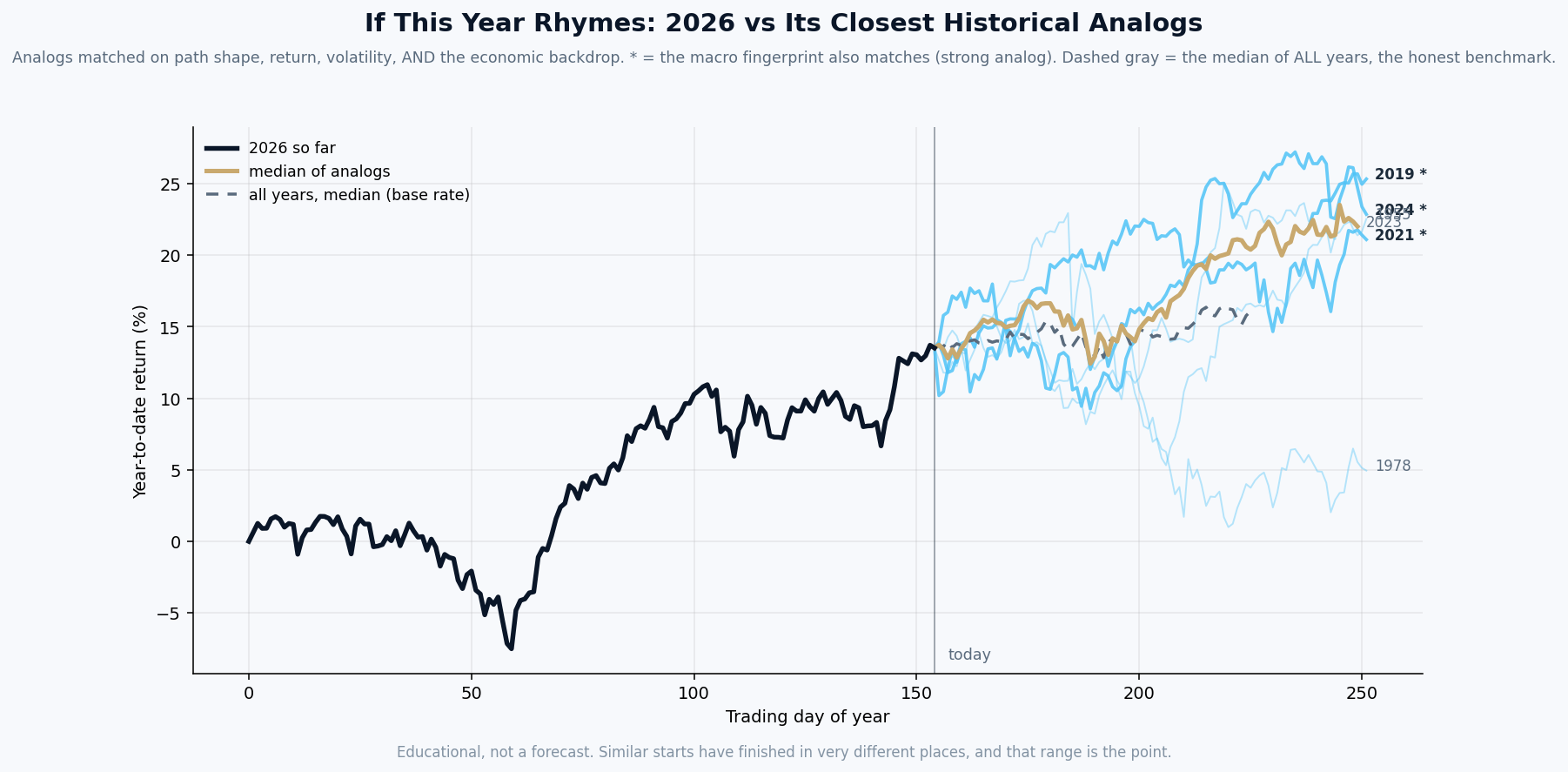
By this week's economic fingerprint, 2026 most closely resembles 2023, then 2024.
What it is. The black line is this year’s market path so far. Each colored line is a past year that our model ranks among the most similar to this one, matched on the shape of the path, its volatility, and the economic backdrop: inflation, interest rates, credit, employment, and more. A star means the economic fingerprint matches especially closely.
How it is built. Rebuilt every week from seventy years of data, using only information that was actually available at each point in history. The years are ranked by the model, not chosen by us.
What it is not. A prediction. Our own testing shows this tool has no ability to forecast where the market finishes the year, and we publish that finding on purpose. What it offers is context: the range of what followed similar setups, so a decision maker can plan for a range instead of betting on a point. The spread between those lines is usually the real lesson.
| Tue | July Housing Starts and Building Permits: a strong number would signal that builders are still committing capital despite 6.67% mortgage rates, which would matter for construction employment and materials demand; a miss would confirm that housing affordability is finally forcing a pullback in supply. |
| Wed | FOMC Meeting Minutes from the July meeting: any signal that the Fed is more concerned about the energy-driven inflation spike than the headline CPI print suggested would push the rate-cut timeline further out, which tightens conditions for every business with floating-rate debt. |
| Thu | Weekly Jobless Claims: the labor market has been the expansion's sturdiest pillar, and any sustained move above 240,000 new claims per week would be the first real sign that the profit cycle's gains are not flowing through to hiring. |
| Thu | July Leading Economic Index (Conference Board): this composite of forward-looking indicators has been the single most consistent early signal in our historical work; a third consecutive decline would put the growth deceleration thesis on firmer footing. |
| Fri | July Existing Home Sales: with mortgage rates at 6.67% and prices still elevated, sales volume is the clearest real-time read on whether housing demand has truly frozen or whether buyers are adjusting to a new normal. |
Free Research
The economy moves fast. We make sure you move faster.
Economic data, policy shifts, and market signals — delivered to your inbox.
Subscribe Free