
ON1010 RESEARCH GUIDE
How to Read the Jobs Report
Understanding employment data, labor market indicators, and their impact on economic policy and financial markets.
The jobs report is the government’s monthly snapshot of how many people are working, who’s hiring, what wages look like, and whether the economy is gaining or losing steam. Think of it as the economy’s vital signs check. Investors, the Federal Reserve, and anyone watching their retirement account pays close attention because employment data shapes everything from interest rates to stock prices.
You’ll learn what the key numbers actually measure, why some data gets revised months later, and how to spot the signals that move markets. We’ll also explore what the Federal Reserve watches for, how to read between the lines, and why understanding this report helps you make sense of broader economic shifts.
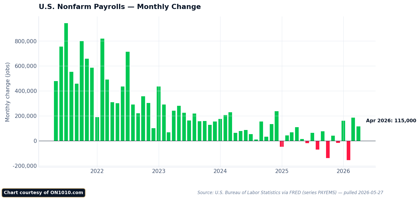
Jobs Report Explained: What It Is and Why It Matters
The U.S. monthly jobs report gives you a monthly snapshot of how many Americans are working, what they’re earning, and where hiring is happening. It arrives on the first Friday of each month and often moves markets before you finish your morning coffee.
Defining the Employment Report
The employment report meaning comes down to three core numbers: how many jobs the economy added or lost, what percentage of Americans are unemployed, and how much wages changed. You’ll see this report called different names. Some call it the Employment Situation Summary. Others refer to it as the nonfarm payrolls report.
The report covers nearly all jobs except farm work. It tells you which industries are hiring and which are cutting back. You get data on average hourly earnings and hours worked per week. This matters because it shows whether businesses are expanding or pulling back.
The data comes from two surveys. One asks about 131,000 businesses and government agencies about their payrolls. The other surveys 60,000 households about their employment status. Together, these create the most detailed picture of the U.S. labor market you can find.
Who Publishes the Jobs Report?
The Bureau of Labor Statistics (BLS) publishes this report. The BLS is part of the U.S. Department of Labor. They’ve been tracking employment data for decades using the same basic methods.
You can trust the numbers because the surveys are massive. The establishment survey covers roughly 670,000 work sites. The household survey reaches across different demographics and regions. This isn’t a guess or estimate based on a few data points.
The BLS doesn’t speculate about what the numbers mean. They just report what they found. That job falls to you, along with investors, economists, and policymakers who interpret the data.
Release Timing and Economic Impact
The jobs report comes out at 8:30 AM Eastern Time on the first Friday of each month. This timing matters more than you might think. It’s usually the first major economic data release each month, which means it sets the tone for everything that follows.
Markets often react immediately. Stocks can jump or fall within minutes of the release. Bond prices shift as traders recalculate their expectations for interest rates. Currency values move as investors compare U.S. economic strength to other countries.
The reaction depends on context, not just the headline number. Strong job growth might push stocks down if investors worry the Federal Reserve will raise interest rates to cool things off. Weak job growth could lift stocks if it means rate cuts are coming. You need to understand what the market expects and what economic conditions exist right now to make sense of the movement.
Key Metrics Decoded: Understanding the Data
The monthly jobs report delivers three core labor market indicators that move markets: nonfarm payrolls show how many jobs the economy added or lost, the unemployment rate reveals who’s actively looking for work, and the participation rate tells you who’s in the game at all.
Nonfarm Payroll Data and Its Significance
Nonfarm payroll data tracks the net change in jobs across the economy each month. This number excludes farm workers, private household employees, and self-employed individuals.
You’ll see this figure reported as a single number: the economy added 200,000 jobs, for example. That’s the net result after counting all the jobs created and all the jobs eliminated across roughly 145,000 businesses and government agencies surveyed.
The survey of businesses and government agencies also breaks down job changes by industry. You can see whether manufacturing added positions while retail shed them. This detail reveals where capital is flowing and which sectors face pressure.
Markets react strongly to payroll surprises. A number well above expectations suggests stronger economic momentum. A weak print raises questions about slowing growth. But here’s the puzzle: you need to watch for revisions in the following two months, which can add or subtract tens of thousands of jobs from earlier reports.
Unemployment Rate Explained
The unemployment rate measures people without jobs who are actively looking for work. This sounds straightforward but requires specific criteria.
You count as unemployed only if you didn’t work during the reference week, you’re available to work, and you actively searched for a job in the past four weeks. People on temporary layoff who expect to be called back also count as unemployed.
The rate comes from a survey of about 60,000 households, separate from the business survey. This creates an interesting tension: the two surveys can tell different stories in the same month because they measure different things.
One critical point: the unemployment rate can fall for good reasons or bad ones. It drops when people find jobs. But it also drops when discouraged workers stop looking and exit the labor force entirely.
Labor Force Participation Rate
The labor force participation rate shows you who’s actually in the game. It measures workers and active job seekers as a percentage of the civilian population aged 16 and older.
This metric captures something the unemployment rate misses: people who’ve stopped looking. When workers get discouraged and quit searching, they drop out of the labor force. They’re not counted as unemployed anymore.
The participation rate stood at 61.4% in February 2021, down 1.9 percentage points from a year earlier. Demographics matter here: as baby boomers retire, participation naturally declines. But sharp drops during downturns signal real economic distress.
You need all three metrics together. Strong payroll growth with falling unemployment and rising participation signals genuine strength. Strong payrolls with falling unemployment but also falling participation? That’s a weaker picture. Capital flows respond to these nuances, not just headline numbers.
Beyond the Headlines: Adjustments and Revisions
The numbers you see flashing across financial news screens rarely tell the complete story. The Bureau of Labor Statistics refines employment figures multiple times after initial release, and these changes can shift your understanding of labor market trends.
Headline Numbers vs Adjusted Figures
When you first see the jobs report, you’re looking at preliminary data. The BLS collects responses from thousands of employers, but not all businesses respond immediately.
The initial payroll figure typically captures about 70% of the total sample. More responses trickle in over the following weeks and months. This creates a predictable pattern: revisions to jobs numbers incorporate additional information that wasn’t available at first release.
You’ll encounter two types of adjustments. Seasonal adjustments account for predictable hiring patterns like retail workers in December or lifeguards in summer. These help you see underlying trends without seasonal noise.
Benchmark revisions happen annually and can be substantial. In early 2025, payroll employment revisions indicated a slowing labor market with employment growth of only 73,000, far below initial estimates. These large adjustments reveal turning points that weren’t visible in real time.
Interpreting Revisions and Their Impact
Jobs report revisions reveal changes in the job market that may not have been visible initially. You need to track whether revisions consistently move in one direction.
When multiple months get revised downward, that signals weakening momentum the market may have missed. Upward revisions across several months suggest stronger conditions than headline numbers indicated.
Pay attention to revision size relative to the headline number. A 200,000 payroll gain that gets revised down to 150,000 changes the story significantly. Markets reprice expectations when cumulative revisions exceed 100,000 jobs.
The timing matters for your analysis. The first revision comes one month after initial release. The second revision arrives two months later. Annual benchmark revisions can reshape the entire previous year’s data, forcing you to reconsider trends you thought you understood.
What the Numbers Reveal: Broader Labor Market Signals
The headline jobs number tells you where employment stands today. The trends beneath it tell you where the economy might be heading tomorrow.
Trends in Job Creation and Sector Strength
Job creation doesn’t happen evenly across the economy. Some sectors add workers aggressively while others shed them.
You can track these patterns by looking at which industries show consistent hiring month after month. Manufacturing might add 15,000 jobs while retail loses 8,000. Healthcare could gain 40,000 while tech cuts 5,000. These shifts reveal where capital is flowing and where it’s pulling back.
Strong sectors signal confidence. When companies in an industry keep hiring, they expect demand to stay strong or grow. When hiring slows across multiple sectors at once, you’re seeing broader caution about future conditions.
The pattern matters more than any single month. Three straight months of construction job gains tells you more than one strong report. Look for acceleration or deceleration in the pace of hiring. That’s where the real signal lives.
Different sectors also pay different wages and require different skills. A thousand healthcare jobs don’t affect the economy the same way a thousand warehouse jobs do. Context shapes meaning.
Wage Growth and Worker Participation
Average hourly earnings show you how much bargaining power workers have. When wages rise quickly, workers are scarce relative to demand. When wage growth slows, that dynamic shifts.
Fast wage growth sounds positive. But it creates tension with inflation. If wages rise 5% annually while productivity stays flat, companies face a choice: accept lower margins, raise prices, or cut costs elsewhere. All three outcomes ripple through markets differently.
You should also watch the labor force participation rate. This tells you what percentage of working-age adults are either employed or actively looking for work. A falling unemployment rate means less when participation drops at the same time. People leaving the workforce entirely change the calculation.
Worker participation reveals structural issues that raw job numbers miss. Are older workers retiring early? Are younger workers staying in school longer? These shifts affect long-term growth potential.
Job Openings, Hires, and Separations
The monthly employment report has a companion: JOLTS data tracks job openings, which measures openings, hires, quits, and layoffs. This reveals demand before it shows up in payroll numbers.
High job openings with slow hiring suggest companies want workers but can’t find suitable candidates. That points to skill mismatches or wage expectations that don’t align. When openings fall sharply, demand itself is weakening.
The quits rate matters too. Workers who voluntarily leave jobs typically do so because they have better options. A rising quits rate signals confidence. A falling one suggests workers feel stuck or worried about finding new positions.
Layoffs and discharges show you the other side. Elevated layoffs mean companies are cutting costs or restructuring. Low layoffs mean they’re holding onto workers even if they’re not adding many new ones. That distinction tells you whether weakness is caution or actual distress.
These labor market indicators combine to form a picture that goes beyond whether 200,000 jobs were added last month. You’re looking at momentum, composition, and tension points that shape how the economy evolves over the next six to twelve months.
The Jobs Report and Financial Markets: Why Investors Care
Employment data moves money faster than almost any other economic release. Strong hiring numbers can send stocks lower if investors fear higher rates. Weak employment can lift bonds while crushing equities.
Stock Market Moves and Employment Data
The stock market reacts to employment trends within minutes of the jobs report release. You might expect strong job growth to always boost stocks. It doesn’t work that way.
When payrolls surge beyond expectations, the initial reaction depends on what investors fear most at that moment. If inflation concerns dominate, strong employment signals potential wage pressure and higher interest rates ahead. That combination often sends equity prices down.
Market participants watch three key elements:
- Payroll surprises: The gap between expected and actual job additions
- Wage growth: Average hourly earnings that signal inflation pressure
- Revisions: Changes to prior months that shift the trend
Your portfolio can swing based on how employment data reshapes growth and inflation expectations. A weaker jobs number might actually lift growth stocks if it reduces rate hike fears. Context matters more than the headline.
Bond Yields and Rate Expectations
Bond markets treat the jobs report as a preview of Federal Reserve policy decisions. Treasury yields often move sharply because the jobs report influences expectations for growth, inflation, and interest rates.
Strong employment data typically pushes yields higher. Bond investors anticipate that tight labor markets create wage pressure, which feeds inflation, which prompts the Fed to raise rates or keep them elevated longer.
Here’s where it gets interesting: the bond market doesn’t just react to one number. Traders assess whether employment strength is consistent or erratic. They compare wage growth to productivity gains. They evaluate whether hiring concentrates in high-wage or low-wage sectors.
You can watch the two-year Treasury yield as a real-time gauge of rate expectations. When jobs data surprises to the upside, that yield jumps as markets reprice the Fed’s likely path.
Investor Sentiment and Volatility
The jobs report creates predictable volatility windows. You face sharp price moves not because the data itself changed company fundamentals, but because it reshapes the macro backdrop against which all assets trade.
Markets often price in forecasts before the release. When actual numbers diverge from those expectations, sentiment shifts quickly. A jobs number that beats forecasts by 100,000 positions can flip bullish sentiment bearish if it raises inflation concerns.
Short-term traders amplify these moves. They position ahead of the release, then react aggressively to surprises. That creates choppy conditions for the first hour after the 8:30 AM ET announcement.
Your challenge as an investor: separate noise from signal. One month’s data gets revised. Seasonal adjustments introduce errors. Weather events distort hiring patterns. Long-term positioning should reflect employment trends over quarters, not single releases that get headlines.
The Fed’s Lens: Labor Data and Policy Decisions
The Federal Reserve treats employment data as one of its most critical decision-making tools. Job market strength influences interest rate decisions, inflation expectations, and the central bank’s entire policy stance.
Why the Fed Watches Jobs Numbers
The Federal Reserve has a dual mandate: maximum employment and stable prices. This means the labor market’s health directly shapes monetary policy.
When you see strong job growth and falling unemployment, the Fed interprets this as an economy running hot. More jobs mean more paychecks. More paychecks mean more spending power flowing through the system.
The inverse matters just as much. Rising unemployment signals economic weakness. The Fed has shown a clear preference for supporting employment over fighting inflation when forced to choose between the two priorities.
Understanding the jobs report helps you anticipate what the Fed might do next. The central bank looks beyond the headline number. They examine wage growth, labor force participation, and hours worked to gauge true labor market conditions.
Monetary Policy Adjustments and the Jobs Report
Interest rate changes flow directly from employment data. Strong job numbers give the Fed room to keep rates higher for longer. Weak numbers push them toward cuts.
This creates a direct link between your Friday morning jobs report and what happens to mortgage rates, business loans, and market valuations. When unemployment ticks up repeatedly, rate cuts typically follow within months.
The timing matters. The Fed meets eight times per year, but the jobs report arrives monthly. This gives policymakers fresh information before most decisions.
Recent patterns show the Fed watching unemployment closely. If the rate pushes above 4.5%, expect more aggressive rate cuts. Capital flows toward assets that benefit from lower rates: growth stocks, real estate, and long-duration bonds.
Jobs Data and Inflation Connections
Employment and inflation share a tight relationship. Too many jobs can overheat the economy. Too few jobs can tip you into recession.
The Fed watches wage growth within the jobs report as an early inflation signal. Rising wages mean workers have more bargaining power. That spending power can push prices higher across the economy.
But this connection isn’t always straightforward. Productivity gains can offset wage increases. If workers produce more value per hour, companies can pay them more without raising prices.
You’ll notice the Fed balancing these forces in real time. Strong wage growth with high unemployment suggests different dynamics than strong wages with tight labor markets. The context around the numbers matters as much as the numbers themselves.
This is why reading the jobs report requires layers of analysis. The headline number tells you what happened. The details tell you what the Fed might do about it.
The Big Picture: History, Cycles, and Structural Shifts
Employment doesn’t move randomly. It follows patterns shaped by interest rates, credit conditions, and the natural rhythm of economic expansion and contraction. Understanding these cycles helps you spot when the labor market is shifting gears before it shows up in headline numbers.
Historical Job Market Cycles and Recessions
The economy moves in a predictable sequence during every business cycle. Construction and manufacturing are the most sensitive to interest rates, which means they react first when credit gets tight or loose.
Look at what happens before recessions hit. Residential construction and durable goods manufacturing contract first. Then the weakness spreads to total construction and manufacturing. Only later does it show up in total payroll numbers.
This pattern held true in March 2000, July 2006, and July 2019. Each time, the cyclical sectors peaked well before the broader economy turned down. If you only watch total nonfarm payrolls, you’re looking at a lagging indicator that tells you what already happened.
Key recession signals:
- Construction jobs stop growing or decline
- Manufacturing payrolls contract
- Full-time work converts to part-time
- People working part-time for economic reasons increases
The time lag matters. Cyclical sectors can show weakness for months or even years before a recession arrives. This isn’t a trading signal. It’s a framework for understanding where you are in the cycle.
Long-Term Labor Market Trends
Your job market looks nothing like your parents’ or grandparents’ did. The structural composition of employment has shifted dramatically over decades.
Manufacturing employed a much larger share of workers in the 1970s and 1980s. Services now dominate. Healthcare, education, and professional services have grown steadily as a share of total employment. Construction fluctuates with housing cycles but remains relatively small.
These shifts change how the economy responds to policy. When manufacturing was larger, recessions hit harder and faster. Service-sector jobs tend to be stickier. They don’t vanish as quickly when demand softens.
Labor force participation tells another story. It peaked in the late 1990s near 67%, then declined through the 2000s and 2010s. Demographics play a role as baby boomers retire. So do disability claims and educational enrollment.
You need to separate cyclical changes from structural ones. Is unemployment rising because of a recession or because the workforce is aging? Is wage growth strong because productivity improved or because labor supply tightened?
Comparing Recent Data to Past Downturns
The unemployment rate sits at 4.4% as of the latest data. That’s a cycle high but far below levels seen in past recessions.
Consider the context. In 2008-2009, unemployment peaked at 10%. In the early 1980s, it exceeded 10%. Even the mild 2001 recession pushed it above 6%. By historical standards, 4.4% represents a tight labor market.
But direction matters more than level. The unemployment rate has been rising from a low near 3.4%. Full-time employment as a share of the labor force dropped from nearly 81% in 2021 to below 79% now. People working part-time for economic reasons increased from 2.5% to 3% of employed workers.
The Federal Reserve’s projections show most committee members don’t expect unemployment to exceed 4.5%. Yet the sequential deterioration in cyclical sectors suggests further weakening ahead. The pattern matches early stages of past slowdowns, not stable equilibrium.
You’re watching competing forces. Labor demand has cooled from pandemic highs. Supply constraints have eased. The question is whether this settles into a soft landing or continues deteriorating into recession. History offers probabilities, not certainties.
Digging Deeper: Reading Between the Lines
The headline numbers only tell part of the story. The real insights emerge when you examine employment subcategories, understand survey limitations, and track metrics that don’t make the front page.
Hidden Patterns in Employment Figures
The most cyclical sectors reveal future trends before they show up in total payrolls. Construction and manufacturing jobs react first to interest rate changes because these industries depend heavily on credit and borrowed money.
Within these sectors, you’ll find even sharper signals. Residential construction and durable goods manufacturing contract first during downturns. Think about it: when money gets expensive, people delay home purchases and big-ticket items like appliances and cars.
Full-time versus part-time employment tells you about labor demand intensity. When companies shift from full-time to part-time workers, they’re responding to softer demand. The jobs report breaks this down further into part-time for economic reasons (can’t find full-time work) versus non-economic reasons (personal choice).
Watch the growth rates across sectors, not just the raw numbers. A sector adding jobs at a slowing pace sends a different signal than one accelerating. These patterns often diverge months before the aggregate data shifts direction.
Spotting Blind Spots and Data Limitations
The jobs report combines two separate surveys with different strengths and weaknesses. The Establishment Survey gives you detailed sector breakdowns but comes with substantial revisions that can change your entire interpretation months later.
The Household Survey produces the unemployment rate with minimal revisions. This makes it more reliable for current conditions, but it lacks the granular details you need for forward-looking analysis.
Here’s where things get tricky: these two surveys can contradict each other in any given month. The Establishment Survey might show strong payroll growth while the Household Survey shows rising unemployment. Neither is wrong. They’re measuring different things.
Birth-death adjustments add another layer of uncertainty. The Bureau of Labor Statistics estimates jobs created by new businesses and lost by closures. These estimates rely on modeling, not direct counting. During turning points in the business cycle, these models often lag reality.
Alternative Labor Market Indicators
Labor force participation rate reveals who’s actually looking for work. The unemployment rate only counts people actively searching. When discouraged workers stop looking, unemployment can fall even as the job market weakens.
Average hourly earnings show wage pressure and worker bargaining power. But you need to adjust for inflation to see real wage growth. Nominal wage gains of 4% mean nothing if prices rose 5%.
Initial jobless claims provide weekly updates between monthly reports. This high-frequency data catches turning points faster. A rising trend in claims often precedes weakness in payroll numbers by several weeks.
The quits rate from the Job Openings and Labor Turnover Survey (JOLTS) measures worker confidence. People quit jobs when they feel secure about finding better opportunities. A declining quits rate suggests workers perceive fewer options and greater risk.
Frequently Asked Questions
The jobs report raises common questions about market movements, Federal Reserve policy, data collection methods, and how investors should interpret employment trends over time.
What can we infer about market reactions from the recent jobs report?
Markets tend to move quickly after jobs data releases because employment numbers shape expectations about interest rates and economic growth. If job gains come in stronger than expected, you might see stock prices fall as investors worry the Fed will keep rates higher for longer. Bond yields often rise in this scenario since traders price in tighter monetary policy.
Weak job numbers create the opposite reaction. Stocks sometimes rally on soft employment data because investors bet on rate cuts, but this depends on whether the weakness signals a mild slowdown or something worse.
The market reaction tells you where capital thinks the economy is heading. When traders push money into defensive sectors after a jobs report, they’re betting on economic weakness. When they pile into growth stocks, they see room for expansion without inflation pressure.
In what ways does the jobs report impact the Federal Reserve’s decision-making?
The Fed watches employment data closely because its mandate includes maximum employment alongside price stability. Strong job growth with rising wages can signal inflation pressure, which pushes the Fed toward higher interest rates. Weak hiring and wage growth give the Fed room to cut rates or hold steady.
You need to understand that the Fed looks beyond the headline number. They examine labor force participation, wage trends across sectors, and how many people work part-time but want full-time jobs.
The central bank moves capital markets through interest rate decisions. Employment data feeds directly into this process because jobs and wages drive consumer spending, which makes up most economic activity.
How do economists interpret fluctuations in the unemployment rate within the jobs report?
The unemployment rate measures the share of people actively looking for work who can’t find jobs. A falling rate usually signals economic strength, but you need context to understand what’s really happening.
Sometimes unemployment drops because people stop looking for work and leave the labor force entirely. This looks good on paper but masks underlying weakness. Other times, the rate rises even as the economy adds jobs because more people enter the labor force seeking work.
Labor force participation rates matter here. When participation rises alongside employment gains, it shows genuine economic strength pulling people into the workforce. When participation falls, a low unemployment rate might hide problems.
What methodologies are used by the Bureau of Labor Statistics to ensure the precision of the employment data?
The BLS surveys about 60,000 households monthly for the unemployment rate and contacts roughly 119,000 businesses and government agencies for payroll data. These two surveys produce different numbers because they measure different things through different methods.
The household survey counts you as employed if you worked at all during the survey week, even at multiple jobs. The establishment survey counts each job separately, so one person with two jobs shows up twice in payroll numbers.
Seasonal adjustments complicate the picture further. The BLS adjusts raw data to account for predictable hiring patterns like retail workers during holidays. These adjustments sometimes miss shifts in when businesses actually hire and fire workers.
Revisions happen regularly. The initial jobs report gets revised twice in subsequent months as more complete data arrives. Annual benchmark revisions can change the story significantly when the BLS incorporates unemployment insurance records covering about 97% of all jobs.
How should one read through the nuances identified in the historical trends of the jobs report?
Historical job data reveals patterns about economic cycles and structural changes in labor markets. You can spot when hiring accelerates or slows relative to past expansions and recessions.
Look at which sectors add or lose jobs over time. Technology sector growth tells a different story than manufacturing decline. Service sector strength compensates for goods-producing weakness in some periods but not others.
Wage growth trends matter more than single month snapshots. Real wage growth accounts for inflation and shows whether workers gain actual purchasing power. Nominal wages can rise while real wages fall if inflation runs hotter.
Compare current data to pre-recession periods rather than just recent months. This helps you distinguish between recovery from a downturn and sustainable expansion. Capital flows toward sectors showing persistent job growth and wage gains that signal productivity improvements.
Can we rely on the jobs report as a sole indicator for evaluating the health of the economy?
No single data point captures economic complexity. The jobs report provides crucial information about labor markets but leaves out consumer spending, business investment, trade balances, and financial conditions.
Employment is a lagging indicator in some ways. Businesses often cut hours before laying off workers, and they hire cautiously even after growth resumes. You might see GDP growth accelerate quarters before strong job gains appear.
Productivity gains complicate the picture too. An economy can grow with modest job gains if output per worker rises significantly. Conversely, weak productivity growth requires lots of hiring just to maintain current output levels.
Financial market conditions shape economic outcomes independent of job numbers. Credit spreads, lending standards, and capital availability determine whether businesses can expand and hire. The jobs report tells you what happened last month, not what capital markets price in for the future.
THE MORNING BELL
The economy moves fast. We make sure you move faster.
Economic data, policy shifts, and market signals — delivered free before the opening bell.
Free every weekday at 6 AM ET. No spam, ever.
Related ON1010 Research Guides
The jobs report connects to several other key economic indicators. Explore these guides to build a more complete picture:
Economic Calendar Guide — See where the jobs report fits in the monthly data release schedule and what other reports to watch alongside it.
Inflation Indicators Explained — Average hourly earnings from the jobs report is one of several wage and price metrics that feed into the inflation picture.
GDP Explained — Employment growth is a key driver of consumer spending, which makes up roughly 70% of GDP. Strong job gains typically support GDP growth.
Yield Curve Explained — A hot jobs report can push bond yields higher and reshape the yield curve, with implications for recession risk and rate expectations.
Stay Ahead of the Data
Get free daily economic analysis delivered to your inbox. Our AI-powered briefings break down the data that moves markets — in plain English.